This soft sand beige container home takes an industrial shell and turns it into something unexpectedly calm, tactile, and deeply livable. Set as if on the open edge of a Midwestern landscape, it feels grounded without being heavy, with clean horizontal lines, wide entries, and a palette of warm neutrals that lets light do a great deal of the decorating. What struck me immediately is how the design balances accessibility with beauty; nothing feels clinical or overly corrected, and every move seems intended to make daily life easier while still feeling elegant. As a concept design, it imagines the container home at its most refined and welcoming.
I’m especially drawn to the way the interior mood unfolds from the exterior restraint. Soft beige cladding, black-framed glazing, pale wood, matte finishes, and gently rounded edges create a home that feels composed rather than stark. There is a generosity to the circulation and a real understanding of how people move, cook, gather, and rest. For me, that is where this home becomes memorable: it doesn’t simply look good in photographs, it suggests a thoughtful, comfortable life inside.
Exterior
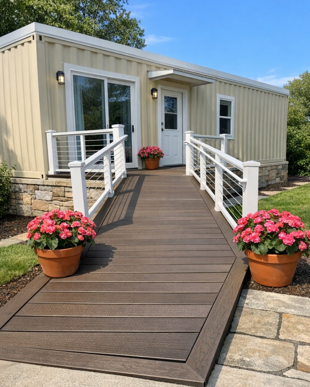
From the outside, the home reads as a carefully proportioned composition of container volumes wrapped in a muted sand beige finish that softens the usual ruggedness of corrugated steel. The color choice is smart; it catches morning and evening light beautifully and gives the structure a sun-warmed character that feels more residential than utilitarian. Black metal window frames and slim exterior lighting provide contrast, while wood accents at the entry and terrace temper the geometry with something more tactile and familiar.
The accessible planning is visible in subtle, well-integrated ways. A gently sloped approach replaces any sense of a formal front step, and the entry threshold appears flush, making the transition feel seamless. Broad pathways, a covered outdoor sitting area, and large expanses of glass all suggest a home designed for ease without sacrificing style. I like that the exterior does not advertise accessibility as an add-on; instead, it is simply part of the architecture, handled with confidence and restraint.
Living Room
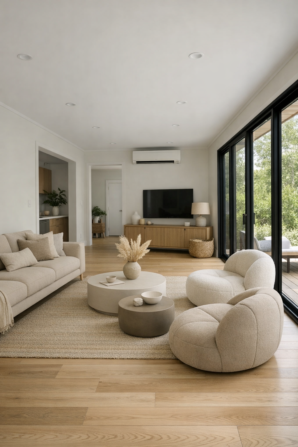
The living room is where the home’s softness really comes into focus. Pale oak flooring runs wall to wall, visually widening the footprint, while warm white walls and sand-toned upholstery keep the atmosphere airy and settled. A low-profile sofa with generous seat depth anchors the space without obstructing sightlines, and a pair of rounded lounge chairs introduces a gentle sculptural note that counters the home’s linear shell. The proportions matter here: furniture is arranged to leave clear circulation paths, so the room feels open, practical, and entirely at ease.
Layered texture does much of the heavy lifting. A flatwoven wool rug in oatmeal and taupe grounds the seating area, linen drapery filters daylight without fuss, and a matte ceramic coffee table adds substance without visual weight. Lighting is handled with similar care, with recessed ceiling fixtures for even illumination and a floor lamp in brushed bronze creating a warmer pool of light by evening. It’s a room that feels quiet in the best possible way, and I can easily picture lingering here with a cookbook, a cup of tea, and no need to rush anywhere.
Dining Room
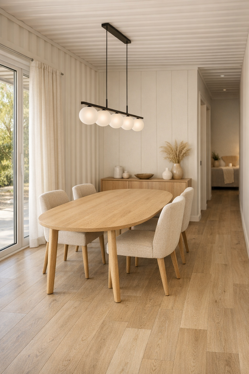
The dining area carries the same unfussy elegance, but with a slightly more social energy. A substantial oval dining table in light natural wood softens the room’s geometry and makes movement around it easier, which is both practical and visually pleasing. Upholstered dining chairs in textured beige fabric bring comfort and absorb some of the hardness that container architecture can sometimes emphasize. Because the palette stays consistent with the rest of the home, the dining room feels connected rather than carved off as a separate zone.
I appreciate the lighting here in particular. A linear pendant with frosted glass globes hangs low enough to create intimacy but not so low that it dominates the room, and its warm glow enriches the beige, cream, and honeyed wood tones. There is likely enough wall space for a slim sideboard, perhaps in white oak with integrated pulls, offering storage without crowding the room. The overall effect is relaxed and versatile, the kind of dining space that could handle a casual soup supper on Tuesday or a long, lingering weekend dinner with friends.
Kitchen
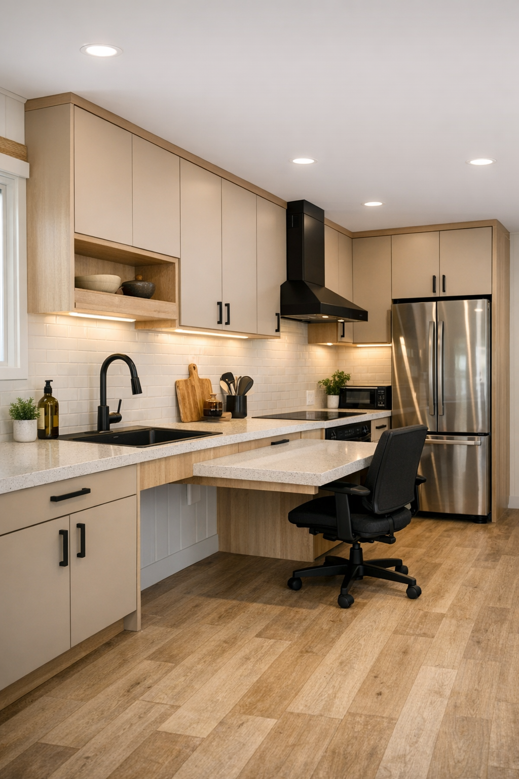
As someone who spends a lot of time cooking, this is the room I studied most closely, and it is exceptionally well considered. The kitchen pairs flat-panel cabinetry in a sandy mushroom tone with pale wood accents and a light quartz countertop that keeps the whole space bright. A long, accessible work surface with knee clearance is integrated so naturally into the layout that it reads as custom luxury rather than accommodation. Wide pathways, easy-reach storage, and a flush transition between zones make the room feel efficient in the same way a good professional kitchen does: calm, legible, and ready for use.
The finishes are practical but never cold. A full-height backsplash in warm off-white adds a clean reflective surface, while matte black hardware and faucets connect visually to the exterior window frames. I can imagine deep drawers organizing pots, spices, and pantry staples beautifully, and perhaps a combination of open shelving and closed storage keeping everyday tools within reach. It’s the kind of kitchen where making a slow braise, rolling dough, or setting out ingredients for a big family meal would feel easy, because the design supports movement and preparation at every step.
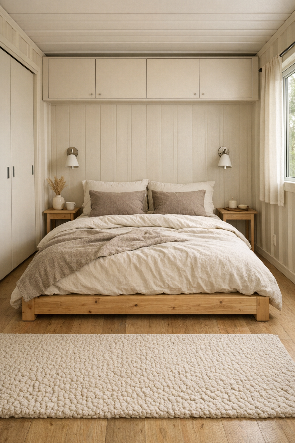
Bedroom
The bedroom leans into serenity without becoming bland. A low platform bed in natural wood, layered with ivory, flax, and soft taupe bedding, keeps the room visually quiet and restful. Because container homes can sometimes feel narrow, the designers have wisely avoided bulky furniture; slim nightstands, wall-mounted reading lights, and built-in storage help preserve openness and circulation. The result is a space that feels breathable, with enough visual softness to offset the crispness of the architecture.
What I like most is the restraint in material changes. A textured area rug underfoot adds warmth first thing in the morning, linen curtains soften the window lines, and a padded bench at the foot of the bed introduces another useful, gentle shape. The color palette remains close to the rest of the house, which gives the bedroom a calm continuity, but it feels slightly more hushed through the use of softer fabrics and lower lighting levels. This is exactly the sort of room that invites real rest instead of simply performing the idea of it.
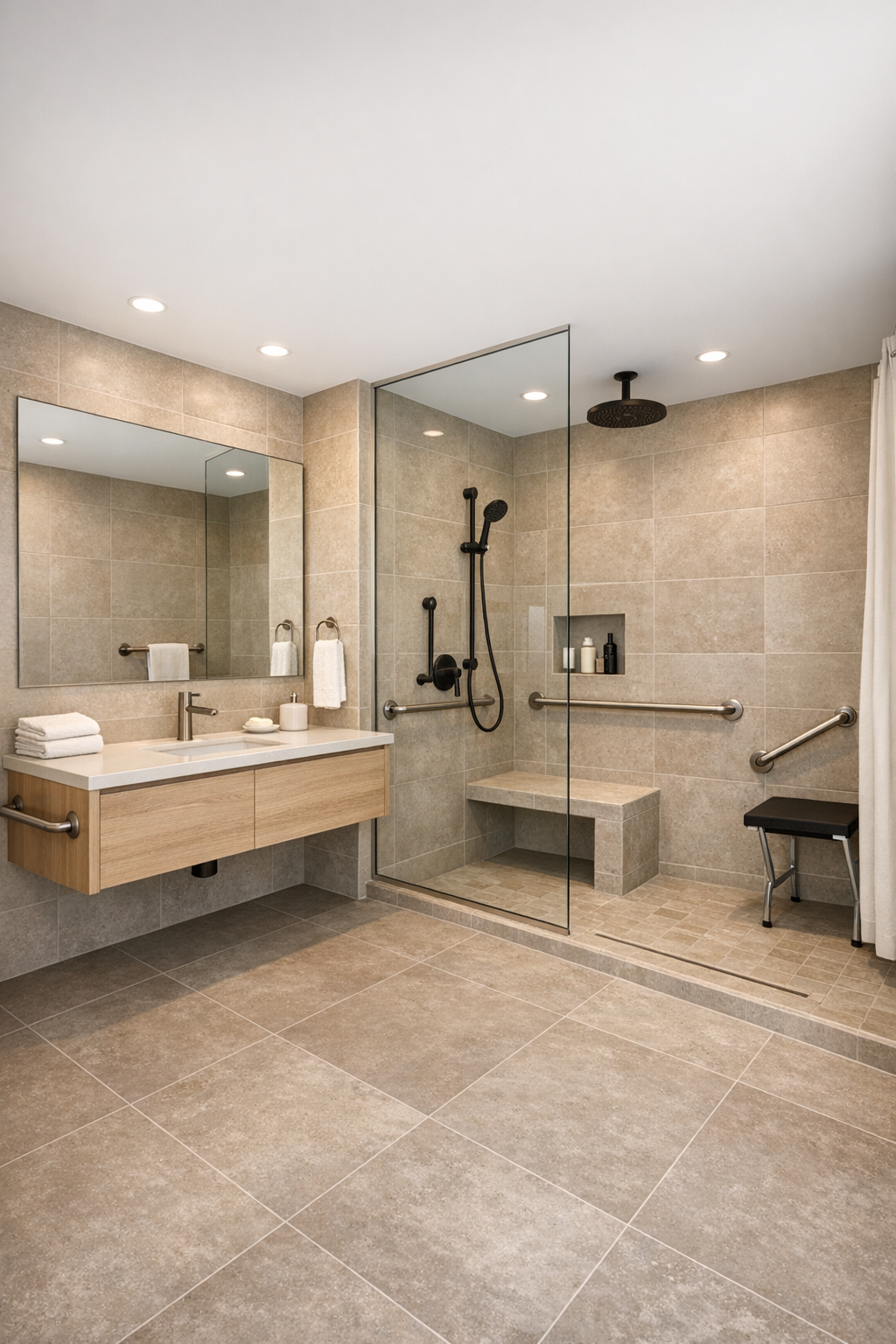
Bathroom
The bathroom continues the home’s thoughtful approach with a clean, open layout that feels generous rather than strictly compact. Large-format porcelain tile in a warm greige tone minimizes grout lines and helps the room read as one continuous surface, while a floating vanity in pale wood lightens the overall composition. A wide mirror amplifies both light and space, and the fixtures, likely in matte black or brushed nickel, introduce just enough definition against the softer finishes.
Accessibility is especially elegant here. A curbless shower with a linear drain keeps the floor visually uninterrupted, and a built-in bench and handheld shower make the room more usable without any loss of style. I would expect good layered lighting as well, with diffuse overhead illumination paired with flattering vanity light for daily routines. This bathroom feels spa-like in the most believable sense: not overdesigned, just calm, functional, and beautifully resolved.
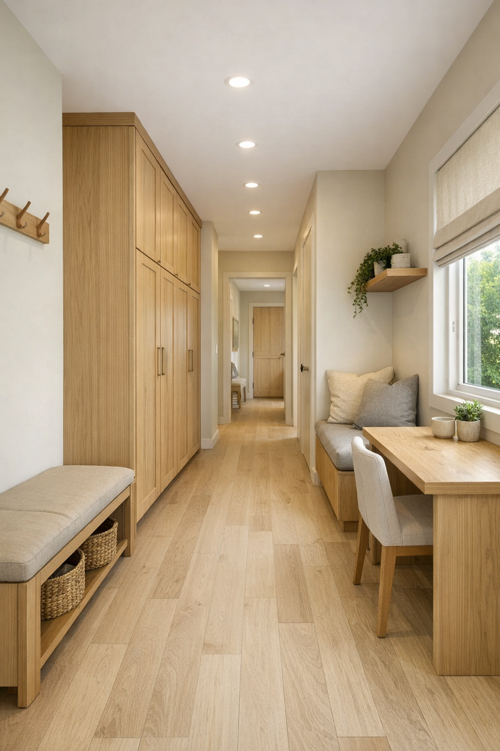
Other Areas
What rounds out the house are the transitional and utility spaces, and this design handles them with unusual care. A compact entry zone likely includes a built-in bench, simple hooks, and closed storage in matching wood tones, making arrivals feel organized instead of improvised. Hallways are kept wide and visually bright, which is important in any home but especially effective here, where thoughtful circulation contributes so much to the sense of ease. Even a laundry nook or secondary storage wall appears likely to be integrated behind flush cabinetry so the architecture stays clean.
I can also imagine a small office corner or reading alcove tucked near a window, furnished with a simple desk, a comfortable chair, and open shelving for books and practical items. These are the spaces that often decide whether a home truly works, and here they seem designed to support ordinary life beautifully. There is room for coats, groceries, boots, trays, folded linens, and all the little equipment of living, yet the home still feels uncluttered and composed.
Why You'd Live Here
You’d live here because it proves that compact, accessible design can also feel warm, tailored, and genuinely beautiful. The container structure gives the home a clear architectural identity, but the soft sand beige palette, pale woods, and restrained detailing keep that identity from becoming harsh. Every room seems to understand how a person actually lives, moves, rests, and gathers, which is not always the case in highly stylized small-home concepts.
For me, the biggest success is the kitchen-through-living core and the sense of calm that runs through the entire plan. This home doesn’t rely on novelty alone; it offers usability, comfort, and a polished visual language that would wear well over time. If you want a home that feels modern without feeling severe, and accessible without ever losing grace, this one makes a compelling case the moment you step inside.