
This light stone gray zero-step container home strikes me as one of those rare designs that manages to feel both disciplined and deeply welcoming. From the outside, its linear form is crisp and modern, but inside, the mood softens into something layered, tactile, and calm. I’m drawn to the way the palette leans into mineral tones, warm woods, blackened steel, and creamy textiles, creating a home that feels metropolitan in its polish yet grounded enough for everyday living.
What makes this concept design especially compelling is how accessibility is treated not as an afterthought, but as the very basis of the architecture. The zero-step approach gives the entire house an ease of movement that changes how the rooms relate to one another, and the container structure brings a certain honesty to the design. It feels efficient without being spare, refined without losing comfort, and full of practical decisions that quietly improve the way a home works.
Exterior
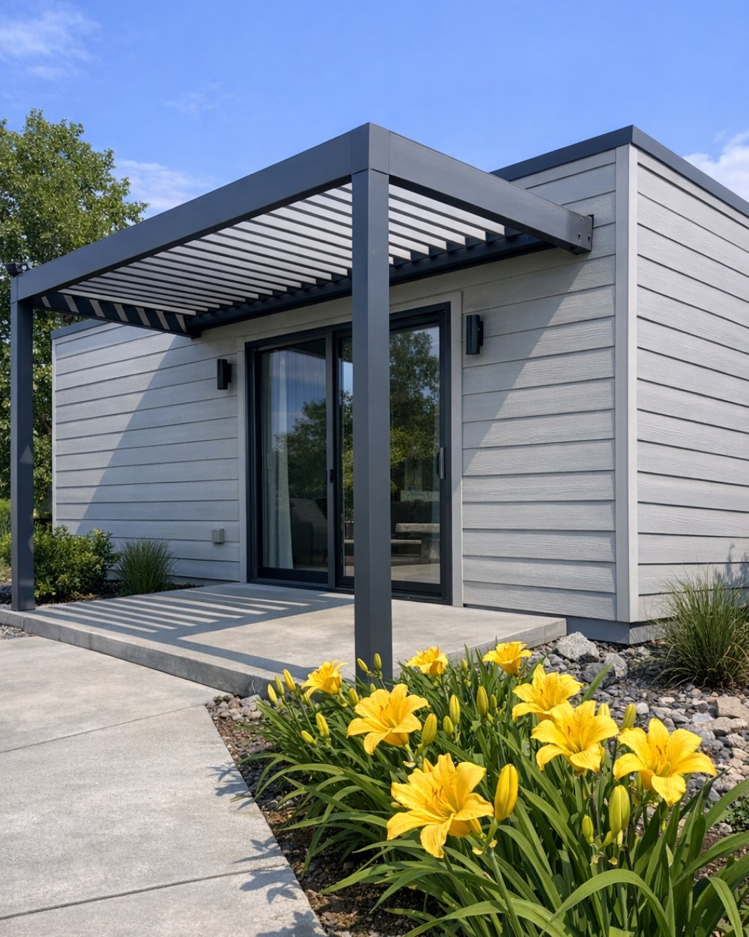
The exterior presents the container form with confidence, finished in a light stone gray that catches daylight beautifully and shifts in tone from cool silver to warmer dove depending on the hour. I like that the design doesn’t try to disguise its industrial origins too much; instead, it balances the clean corrugated shell with generous glazing, simple black-framed windows, and a low-profile entry that emphasizes the zero-step threshold. The result is streamlined but not severe, especially with the addition of natural wood soffits and a modest terrace that softens the geometry.
Landscape choices would make a major difference here, and I imagine this home set against ornamental grasses, poured concrete paths, and restrained planting beds in greens and silvery sages that echo the façade. Exterior lighting is best kept architectural and understated: recessed soffit lights, slim path lights, and a warm wash near the entrance rather than anything too decorative. Altogether, the home reads as modern, practical, and surprisingly serene, with an exterior that prepares you for the polished interiors without giving everything away at once.
Living Room
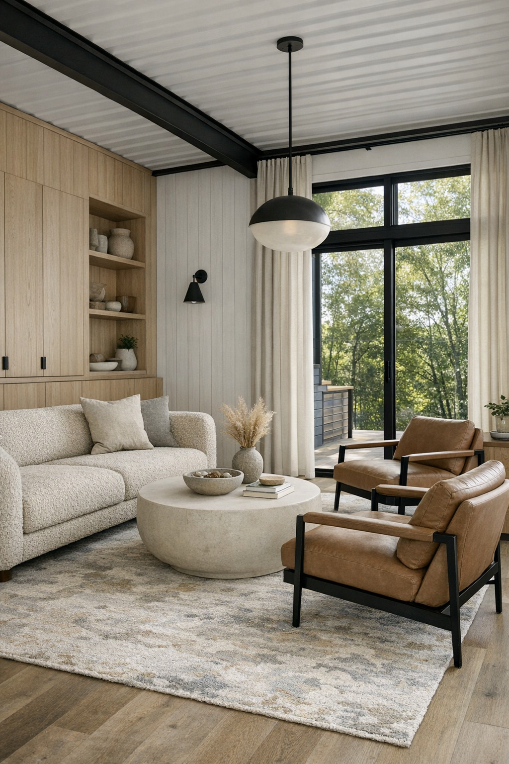
The living room feels like the heart of the home’s softer side. Because container homes can easily veer too narrow or hard-edged, I appreciate how this space would use width strategically, with a low, deep sofa in oatmeal boucle, a pair of sculptural lounge chairs in warm taupe leather, and a substantial rug in a faded stone-and-ivory pattern to visually broaden the room. The walls stay light and quiet, while white oak millwork and black steel detailing bring rhythm and definition without cluttering the view.
Lighting does a great deal of work here. Daylight pours in through oversized glazing, then in the evening the room shifts into a warmer register with recessed ceiling lights, a long linear wall sconce, and a shaded floor lamp tucked beside the sofa for a more intimate pool of light. I can easily picture a ceramic coffee table styled with a few cookbooks and a tray for tea, while textured drapery panels soften acoustics and add another layer of comfort. It’s a modern room, certainly, but it doesn’t feel formal; it feels lived-in in the best sense.
Dining Room
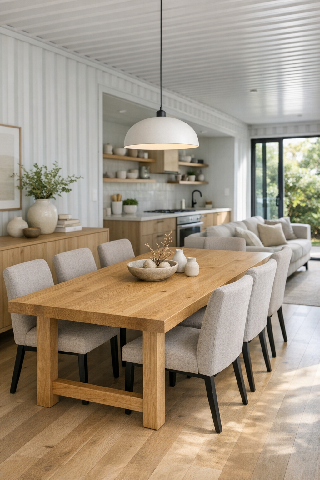
The dining room continues the restrained palette but introduces a little more formality through proportion and repetition. I imagine a solid white oak dining table with softened edges, surrounded by upholstered dining chairs in a warm greige fabric that keeps the space comfortable for long meals. In a home like this, where every square foot matters, the dining area would likely sit in a fluid open-plan relationship with the living room and kitchen, yet still feel distinct thanks to a centered pendant light and a subtle change in material underfoot.
What I find especially appealing is the opportunity for this room to feel intimate without becoming heavy. A plaster-finish wall or a built-in sideboard in pale wood would add just enough texture, and the styling could stay simple: a ceramic bowl, linen runner, maybe a branch clipping for height and movement. As someone who spends plenty of time thinking about how people gather around food, I always notice whether a dining room invites conversation, and this one absolutely would. The scale feels easy, the seating looks comfortable, and the atmosphere is polished without losing warmth.
Kitchen
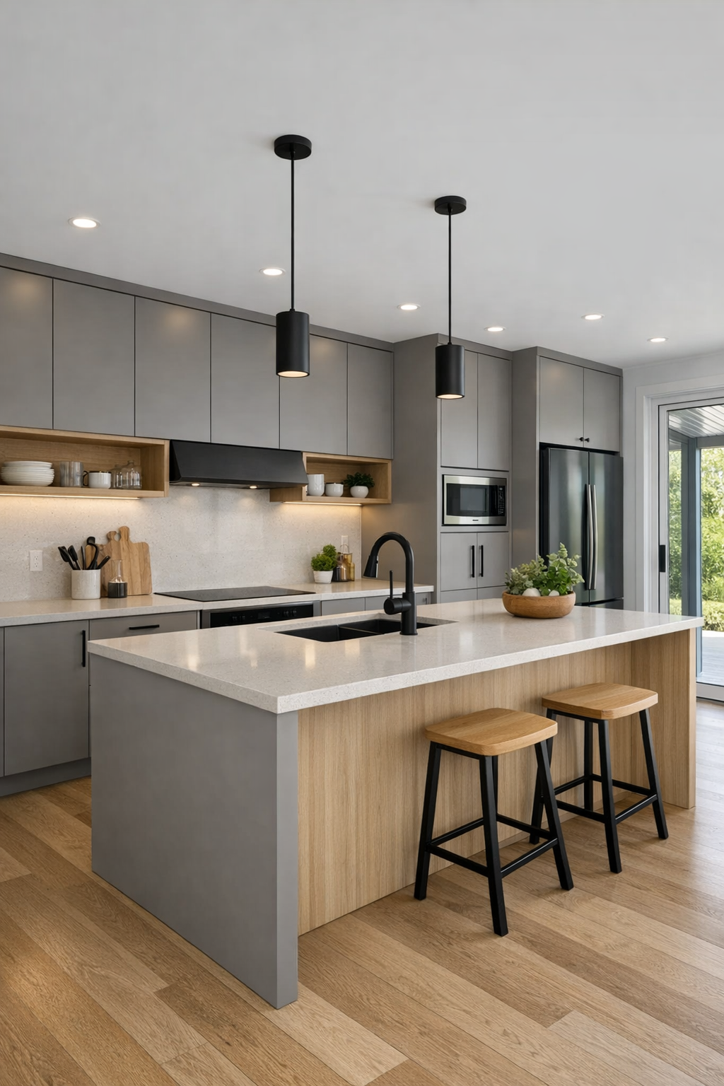
The kitchen is where this home really wins me over. A well-designed kitchen can make even a compact footprint feel generous, and here I picture flat-panel cabinetry in a warm mushroom-gray paired with white oak accents and pale quartz countertops with very soft veining. The layout would need to be efficient and barrier-free, so I imagine wide circulation paths, integrated appliances, deep drawers instead of awkward uppers in key zones, and a substantial island that doubles as prep space and casual seating.
Because I cook a lot, I’m always looking for kitchens that are not only beautiful but sensible, and this one seems built for actual use. Under-cabinet lighting would brighten the work surfaces, matte black fixtures would sharpen the palette, and a full-height slab backsplash would keep the lines clean. I’d love to see open shelving used sparingly for everyday ceramics, oils, and perhaps a few favorite spices, while a concealed pantry wall keeps visual noise to a minimum. The whole room feels organized, bright, and deeply functional, which is exactly what I want in a kitchen that’s meant to support real life.
Bedroom
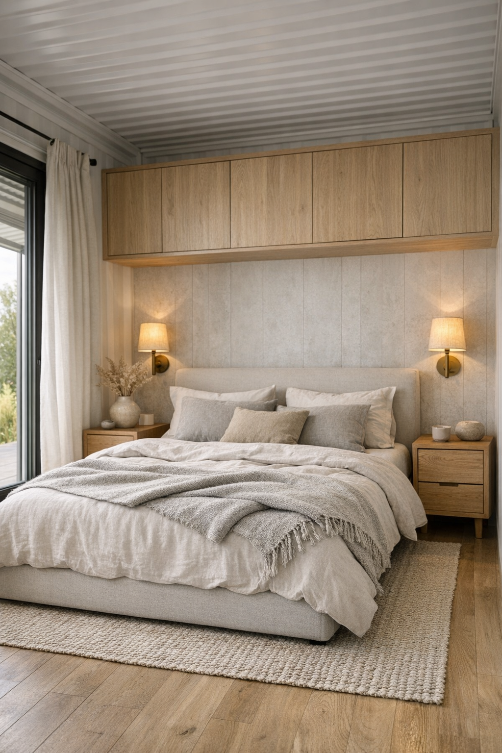
The bedroom takes the home’s modern language and quiets it down even further. I picture a low-profile bed in a warm upholstered fabric, flanked by simple oak nightstands and softly glowing sconces that free the surfaces for books, a glass of water, or nothing at all. The palette remains tonal and restful, with stone, flax, sand, and muted gray working together to create a room that feels uncluttered and genuinely restorative.
Texture matters more than color here, which is often the right move in a compact contemporary home. Linen bedding, a wool throw, a nubby area rug, and full-height drapery would all help absorb sound and soften the container shell. Built-in storage is essential, and I’d expect clean-lined wardrobes or a wall of integrated cabinetry that blends with the architecture rather than interrupting it. The overall feeling is cocooning but not dark, minimal but not cold, and thoughtfully edited in a way that supports rest.
Bathroom
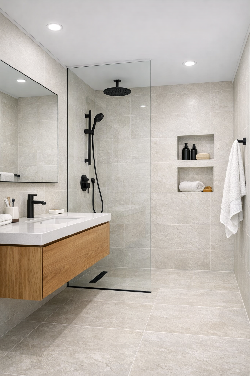
The bathroom appears to embrace the same zero-step philosophy in a way that feels elegant rather than clinical. A curbless shower with a frameless glass panel would make the room feel larger and easier to use, while large-format porcelain tile in a pale limestone tone keeps grout lines minimal and the atmosphere serene. I can see a floating oak vanity beneath a broad mirror, with matte black plumbing fixtures adding enough contrast to keep the space crisp.
What elevates the bathroom is the balance between accessibility and spa-like restraint. Recessed niches, integrated lighting, and practical storage drawers would keep everyday items close at hand without cluttering the counters. The finishes do not need to shout; in fact, the simplicity is the luxury here. Soft towels, a rounded stool, and perhaps a small plant would be enough to bring life into the room. It feels easy to maintain, easy to move through, and genuinely pleasant to spend time in, which is exactly the point.
Other Areas
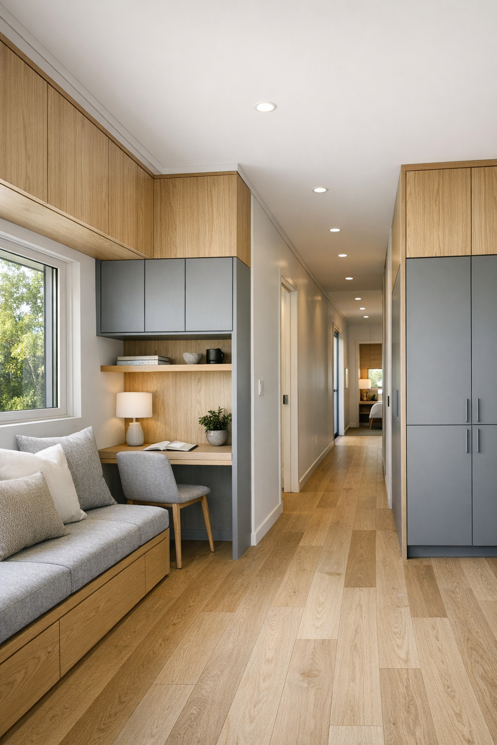
In a home like this, the success is often in the in-between spaces, and I suspect the circulation areas are doing more than they first appear to do. Hallways would be kept wide and visually open, likely with continuous flooring and flush transitions that reinforce the zero-step design. A compact office nook, reading corner, or built-in bench near the entry could turn otherwise leftover space into something genuinely useful, and I’d expect the millwork to stay consistent so the entire home feels cohesive.
I’m also imagining a laundry zone or utility wall handled with the same care as the more public rooms, perhaps concealed behind full-height cabinetry in the same oak-and-gray language as the kitchen. That continuity matters. When smaller support spaces are treated thoughtfully, the whole home feels elevated. Even storage can become part of the aesthetic when doors are flush, hardware is restrained, and every surface contributes to the calm, tailored rhythm of the interiors.
Why You'd Live Here
You’d live here because it proves that compact, accessible design can still feel refined, warm, and deeply intentional. The zero-step layout makes daily life simpler, while the container structure gives the home a strong architectural identity that doesn’t rely on excess to make an impression. Every room seems to understand its job, and just as importantly, every material feels chosen to support comfort as much as style.
For me, the real appeal is that this home doesn’t separate beauty from usefulness. The kitchen looks ready for serious cooking, the dining area encourages lingering, the living room invites you to settle in, and the quieter rooms maintain that same calm discipline. It’s modern without being hard, efficient without being cramped, and memorable because of the details rather than in spite of them.