
This light greige single-story container home has the kind of quiet confidence I always notice right away: clean lines, a low-slung profile, and a soft neutral palette that makes the whole place feel calm before you even step inside. Set in a peaceful open landscape, it blends modern container architecture with a gentler, more lived-in warmth, using natural wood, layered textiles, and sunlight as part of the design language. Even as a concept design, it feels wonderfully believable to me because every choice seems aimed at making daily life easier, brighter, and more comfortable.
What makes this home special is how thoughtfully it balances simplicity with personality. The greige exterior sets a serene tone, but inside, the rooms unfold with a lot more richness than you might expect, from tailored built-ins to cozy seating and hardworking kitchen details that would make family dinners feel just a little more special. I’m always drawn to homes that don’t just look polished but also seem ready for real routines, and this one manages to feel both beautifully edited and genuinely welcoming.
Exterior
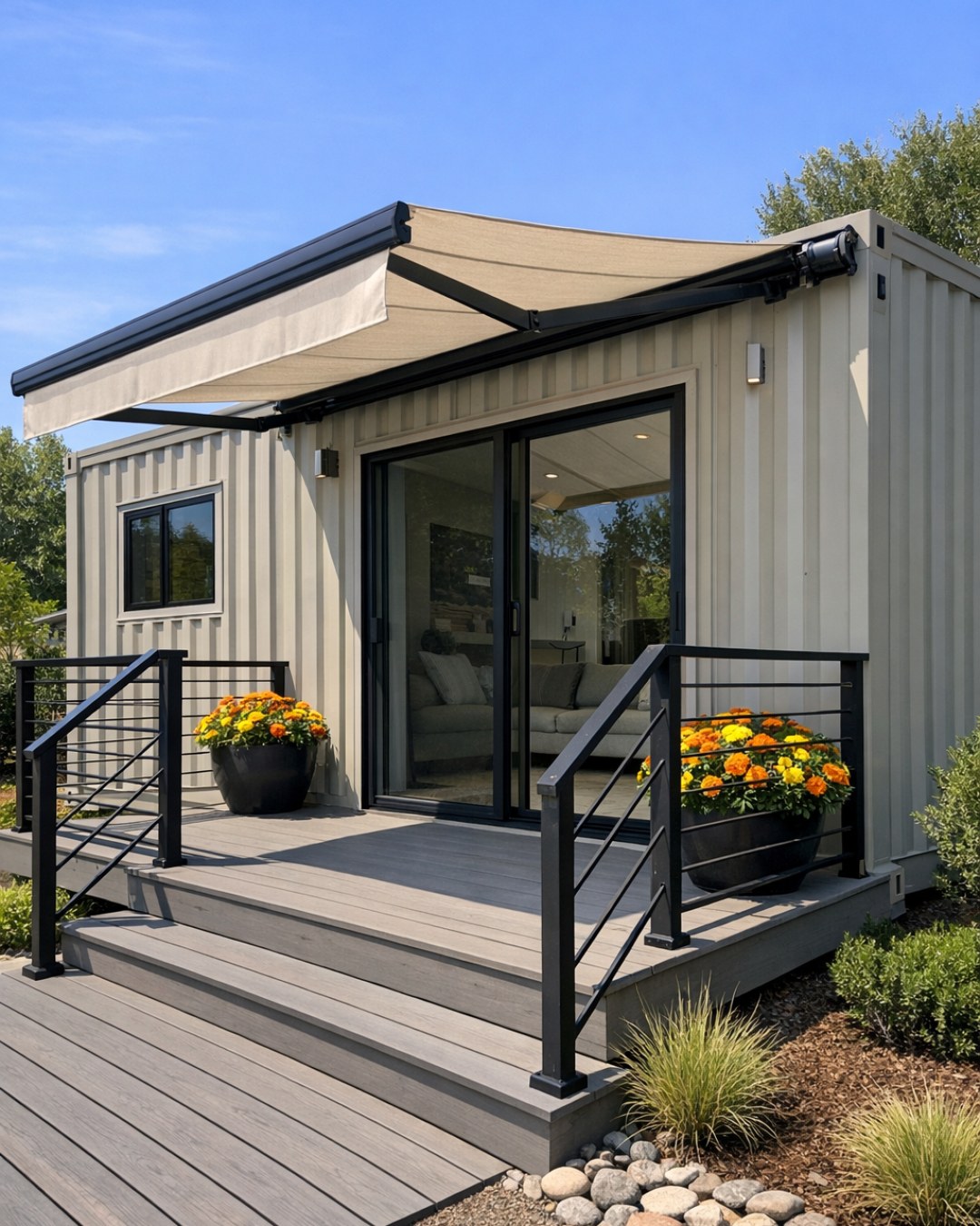
From the outside, the home keeps its container roots visible in the best possible way, with long horizontal forms, crisp edges, and a practical footprint that feels intentional rather than stark. The light greige finish softens the industrial silhouette, giving the structure a more residential, approachable character, especially when paired with black-framed windows and warm wood accents around the entry. I like how the restrained palette lets the proportions do the talking while still feeling gentle enough for an everyday family setting.
The landscaping is minimal but not bare, with gravel paths, low ornamental grasses, and a simple patio zone that extends the home without competing with it. That kind of setup makes a lot of sense to me because it is low-maintenance, tidy, and still inviting, especially for households that would rather spend time hosting friends than fussing over the yard. Altogether, the exterior feels modern and efficient, but never cold.
Living Room
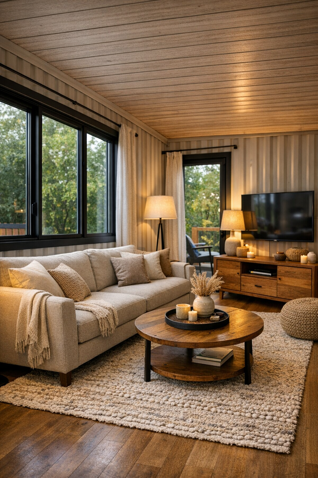
The living room is where the home’s softness really comes through. A generously scaled sofa in a warm oatmeal fabric anchors the space, layered with muted taupe, clay, and cream pillows that add comfort without clutter. Opposite it, a low wood media console and a textured area rug help ground the room, while slim black accents echo the window frames and keep the palette from feeling too sweet. I can easily picture this being the spot where everyone gathers after dinner, with enough space for adults to relax and kids to sprawl out with books or a movie.
Natural light does a lot of the work here, pouring in through broad windows and bouncing off pale walls with a soft matte finish. The ceiling treatment stays simple, which suits the architecture, but the lighting still feels considered: a sculptural floor lamp in one corner, a pair of understated sconces, and warm ambient lighting that would make the room feel cozy by evening. One of my favorite touches is the use of layered textures instead of loud color, because that is often the easiest way to make a family room feel polished while still forgiving everyday life.
Dining Room
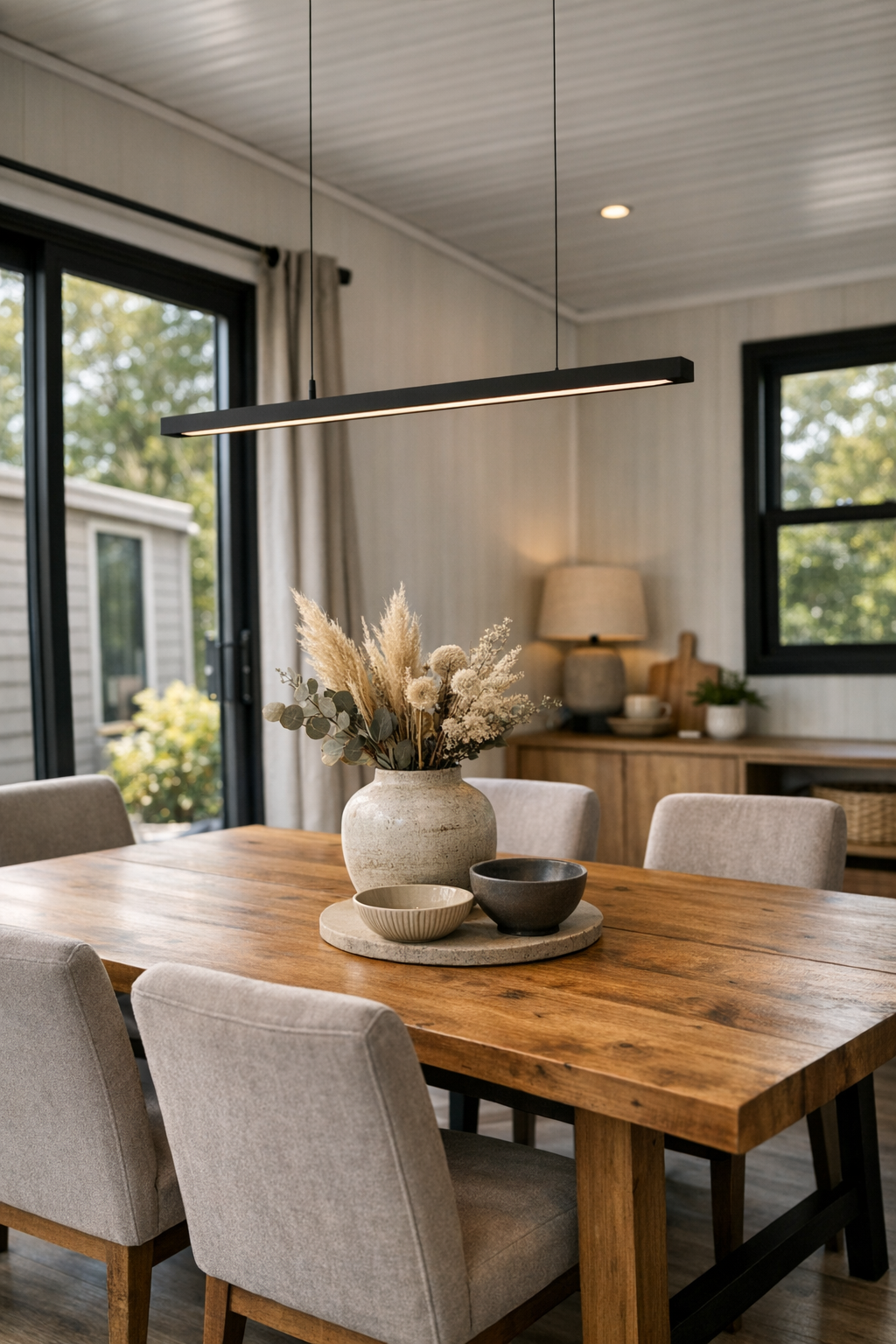
The dining room continues the same calm palette but gives it a little more structure. A substantial wood dining table with a natural grain finish sits at the center, surrounded by upholstered chairs in a soft greige tone that make the space feel comfortable enough for lingering meals. As someone who loves cooking for family and friends, I always appreciate a dining area that feels dressed up without being precious, and this one does exactly that. It has enough presence for a holiday meal but still looks easy for a weeknight pasta dinner.
Overhead, a linear pendant adds definition and keeps the long proportions of the room feeling intentional. The styling stays simple, maybe a ceramic bowl, a linen runner, and a few branches, which suits the home’s clean architectural lines. If I were borrowing one idea from this room, it would be the mix of practical durability and softness: easy-to-clean fabrics, a sturdy tabletop, and enough visual warmth that even picky eaters might be persuaded to sit a little longer and try one more bite.
Kitchen
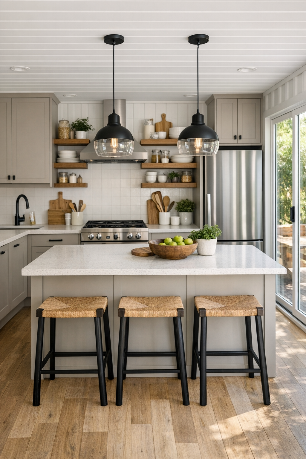
The kitchen is easily one of the strongest spaces in the house, and I say that as someone who always notices whether a kitchen would truly support real cooking. Flat-front cabinetry in a pale greige keeps the lines sleek, while warm wood open shelving breaks up the run and gives the room a more personal, lived-in feel. The countertops appear to be a light quartz with subtle movement, and the backsplash remains clean and simple, letting texture and material do the decorating. It is the kind of kitchen that would look beautiful in photos but also hold up well to pancake mornings, soup simmering on the stove, and a crowd gathered around for snacks.
The layout is smart and efficient, with generous prep space, integrated storage, and an island that doubles as both work surface and casual seating zone. I especially like that this kind of setup makes it easy to serve different tastes without making mealtime feel complicated; you could lay out taco toppings, baked potato fixings, or a simple fruit-and-muffin breakfast and let everyone build their own plate. Pendant lights over the island add warmth and focus, and the mix of soft neutrals with black hardware gives the whole room a crisp finish without losing its inviting heart.
Bedroom
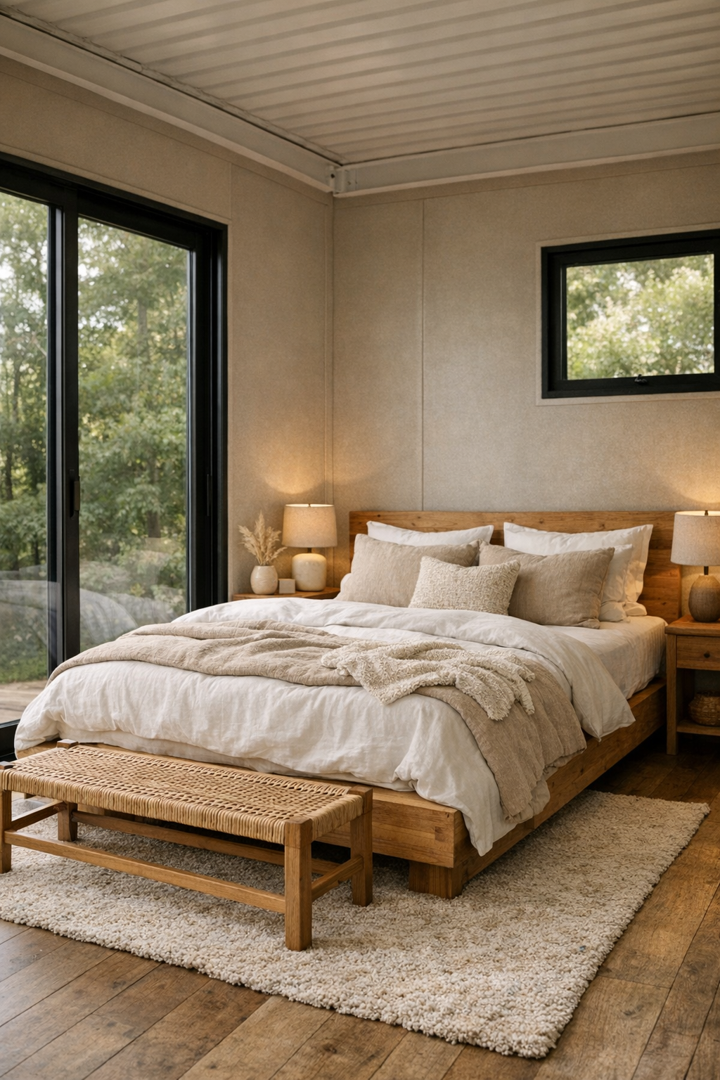
The bedroom feels pared back in the most restful way, using the home’s neutral palette to create a true retreat. A low platform bed in natural wood, layered with white, oatmeal, and sand-toned bedding, keeps the room serene while still feeling soft and inviting. There is very little visual noise here, which I think is part of its success; every piece, from the bedside tables to the linen drapery, seems chosen to support calm. In a home with such clean architecture, that restraint really matters.
What keeps the room from feeling flat is the attention to texture. A woven bench at the foot of the bed, a plush rug underfoot, and subtle wall lighting all add warmth without overpowering the simplicity. I also like the way the windows seem to frame the outdoors almost like artwork, giving the space a connection to the landscape that makes mornings feel slower and evenings feel quieter. It is a bedroom that doesn’t ask for much, and that is exactly why it works so well.
Bathroom
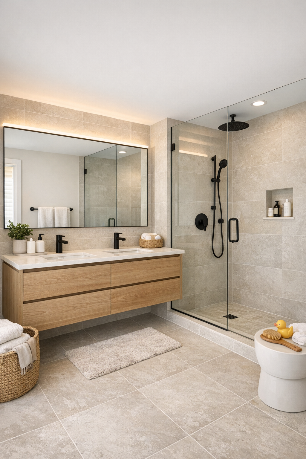
The bathroom takes the same disciplined palette and gives it a slightly more spa-like edge. Soft stone-look tile, a floating wood vanity, and matte black fixtures create a clean composition that feels modern but not severe. I love bathrooms that feel easy to maintain while still giving you one beautiful moment, and here that moment is the contrast between the pale surfaces and the darker metal details. It looks fresh, airy, and quietly luxurious.
A frameless glass shower keeps the room visually open, while careful lighting around the mirror helps soften all those crisp lines. There is also a practical side to the design that I appreciate: enough vanity surface for everyday routines, closed storage to keep clutter tucked away, and finishes that would stand up well to busy mornings. It is a lovely reminder that small spaces can still feel generous when the materials are cohesive and the layout is thoughtfully resolved.
Other Areas
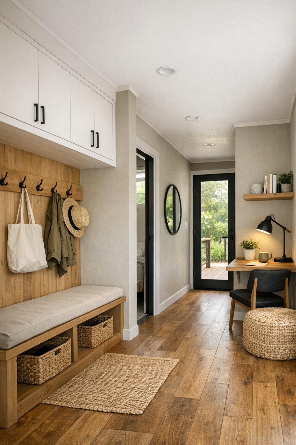
What rounds out the home so nicely are the transition spaces and built-in moments that make a compact footprint feel complete. A simple entry nook with hooks, a bench, and concealed storage would be such a gift in daily life, especially for keeping bags, shoes, and jackets from spilling into the main rooms. Hallways are kept bright and uncluttered, with the same warm flooring running throughout to create continuity and make the home feel larger than it is.
I can also imagine a flexible extra zone tucked along one side, perhaps a small reading corner, a compact home office, or a multipurpose utility space with smart cabinetry. In family life, those in-between areas often do more heavy lifting than the showpiece rooms, and this home seems to understand that beautifully. Everything feels intentional, edited, and ready to adapt, which is often the secret to making a modest-sized home feel truly generous.
Why You'd Live Here
You would live here because it proves that efficient design does not have to feel spare. This home takes the disciplined structure of a container build and wraps it in warmth, light, and thoughtful details that support everyday routines, from cooking and gathering to resting and resetting. I think that is what makes it so appealing: it is modern, yes, but it also understands the softer side of home.
More than anything, this is a place that feels manageable in the best sense. The palette is timeless, the materials are practical, and the rooms seem designed for real life rather than performance. For anyone who wants a home that feels edited but still nurturing, stylish but still easy, this one offers a very convincing vision of how beautiful simple living can be.