
From the outside, this home reads as calm and composed: soft pebble gray cladding, crisp trim, and a low, modern silhouette that feels both practical and unexpectedly elegant. Built from repurposed container volumes and shaped into a highly refined concept design, it has that rare balance I always appreciate—spaces that are efficient without feeling tight, and contemporary without turning cold. Set against a simple landscaped site, the house feels grounded and approachable, the kind of place that invites you in before you have even reached the front walk.
What makes it special is how accessibility is handled as a design strength rather than an afterthought. The circulation is generous, the thresholds are easy, and the transitions from one space to the next feel smooth and intuitive. As someone who spends a lot of time thinking about how a kitchen should work and how a room should support daily life, I find this layout especially satisfying. There is a quiet intelligence to it, with every material and proportion chosen to create ease, light, and a sense of dignity.
Exterior
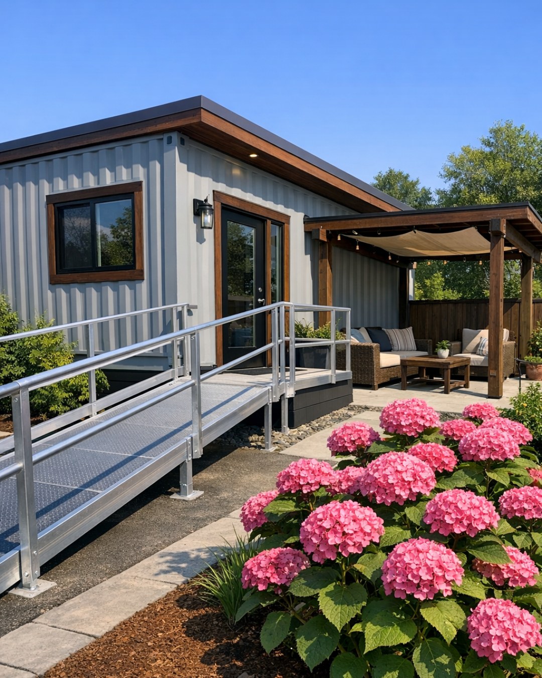
The exterior composition makes excellent use of the container framework, but you would never mistake it for something improvised. The pebble gray finish softens the industrial bones, while slim black window frames add definition without making the facade feel severe. I like the way the massing is broken into clean horizontal forms, giving the home a long, settled presence rather than a stacked or boxy look. A gently sloped walkway, broad landing, and deep overhang at the entrance reinforce the accessible planning while also lending the house a polished architectural rhythm.
Landscaping is kept deliberately restrained, which is exactly the right move here. Low ornamental grasses, clipped shrubs, and wide pavers provide texture without cluttering the approach. The materials feel durable and honest—powder-coated metal, fiber cement, concrete, and wood accents that warm the palette just enough. Altogether, the exterior has a measured, comforting quality. It feels modern in the clearest sense: efficient, thoughtful, and designed to make everyday living simpler.
Living Room
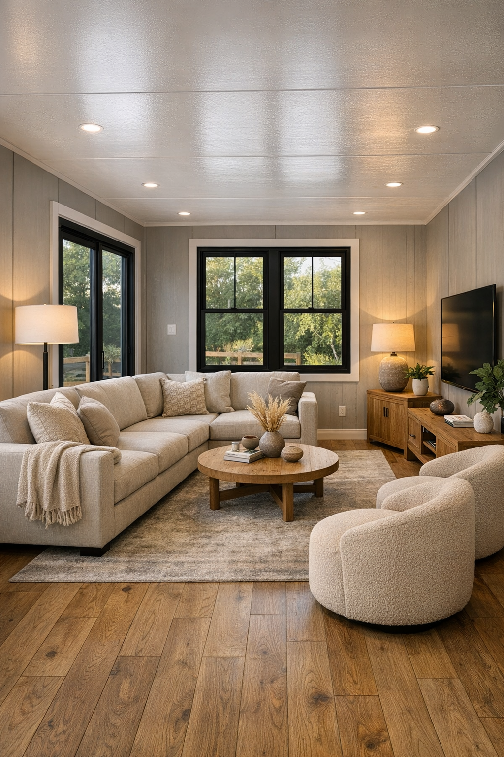
The living room opens with a sense of width that is especially striking in a container-based home. Rather than fighting the linear footprint, the design embraces it with a clear layout anchored by a low-profile sectional in warm oatmeal fabric, a pair of rounded accent chairs, and a generously scaled rug in soft stone and taupe tones. The palette is quiet and layered—pebble gray, cream, sand, and touches of muted charcoal—so the room feels expansive and restful. Wide-plank oak flooring runs throughout, visually stretching the space and giving it a natural warmth that keeps the contemporary lines from feeling rigid.
Lighting is handled beautifully here. Recessed ceiling lights provide even illumination, but the room gets its character from the daylight pouring through large black-framed windows and from the softer pools of light created by a linen-shaded floor lamp and subtle wall sconces. I especially like the mix of textures: boucle upholstery, ribbed wood millwork, matte ceramic accessories, and a slim media wall with integrated storage that keeps everything tidy. It is a room designed for real living—easy conversation, quiet evenings, and the kind of comfort that never has to announce itself.
Dining Room
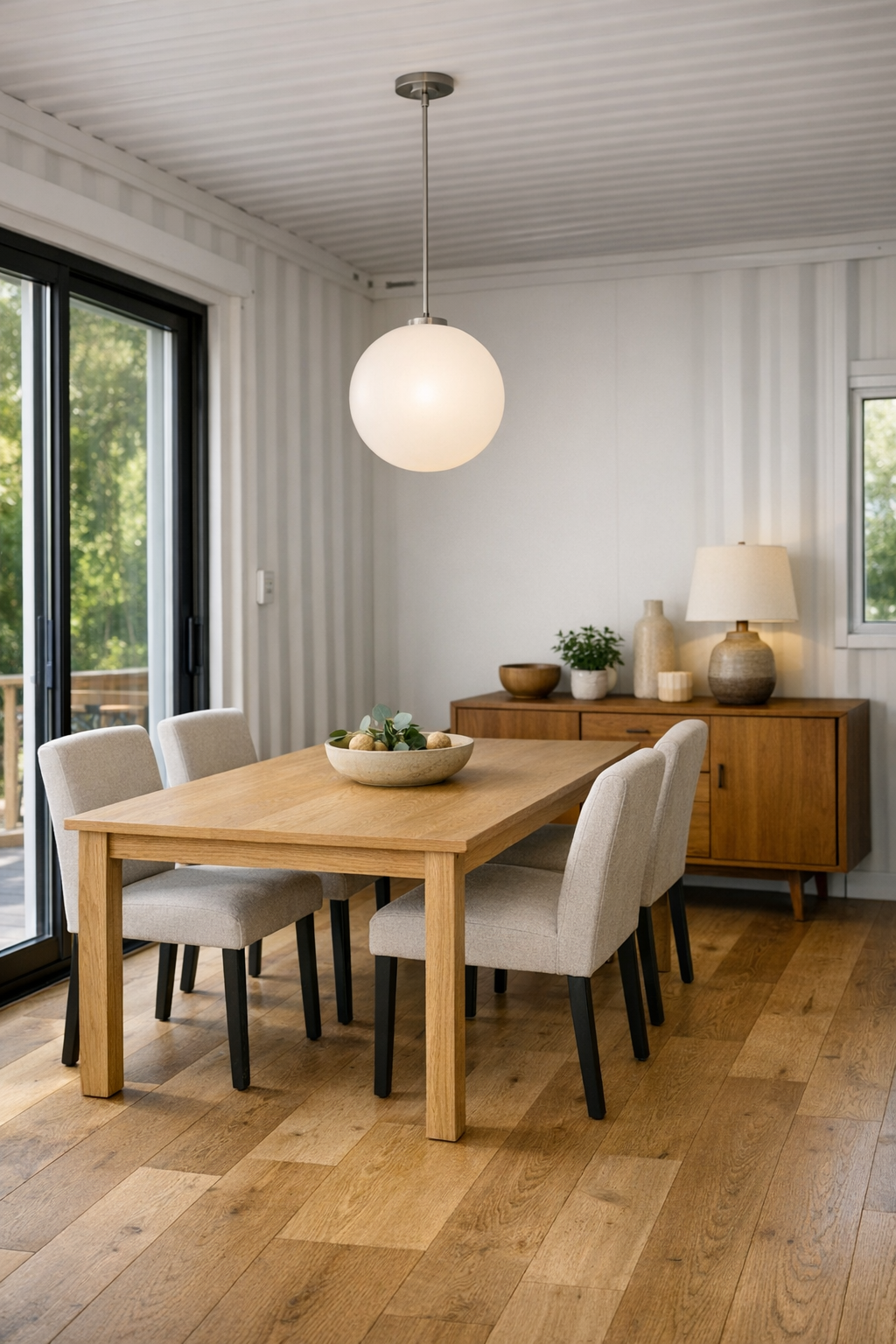
The dining area sits comfortably between the living room and kitchen, acting as both connector and destination. A rectangular dining table in pale oak is paired with upholstered chairs that have supportive, open silhouettes, allowing movement around the table to feel easy and unforced. The proportions are smart: there is plenty of clearance, but the room still feels intimate enough for lingering meals. I can easily imagine a long Sunday lunch here, with dishes set out family-style and light shifting across the tabletop through the afternoon.
Visually, the room stays aligned with the rest of the house through its restrained palette and tactile materials. A sculptural pendant with frosted glass globes hangs low enough to define the table without blocking sightlines, and a minimalist sideboard in warm wood provides both storage and a bit of visual weight along one wall. The finishes are matte and forgiving—nothing too precious, which I always appreciate in a dining space meant to be used often. It has a clean, breathable look, yet it still feels welcoming, never stark.
Kitchen
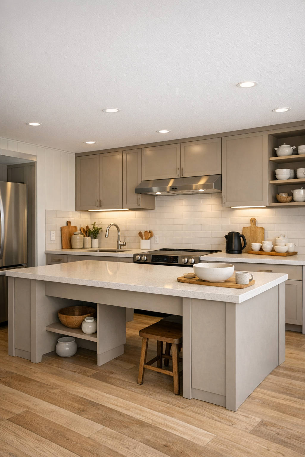
This kitchen is where the home’s thoughtful planning really shines. The layout is wonderfully open, with broad circulation paths, lowered work surfaces integrated gracefully into the cabinetry plan, and an island designed to be usable from multiple positions. Flat-panel cabinets in a warm greige tone keep the lines clean, while quartz countertops in a pale honed finish brighten the room and reflect light beautifully. As someone who cooks seriously, I notice details like landing space near the appliances, deep drawers for cookware, and a clear workflow that makes prep, cooking, and cleanup feel seamless.
The material choices are understated but highly effective. A full-height backsplash in soft off-white adds brightness without harsh contrast, and brushed metal hardware gives just enough definition. Open shelving is used sparingly, which helps maintain a calm look while still allowing a few ceramic bowls, wooden cutting boards, and everyday dishes to lend personality. Under-cabinet lighting adds practical clarity at the counters, and the overall effect is a kitchen that feels capable, serene, and exceptionally well resolved. It is the kind of space where making soup from scratch or trying a new spice blend would feel equally natural.
Bedroom
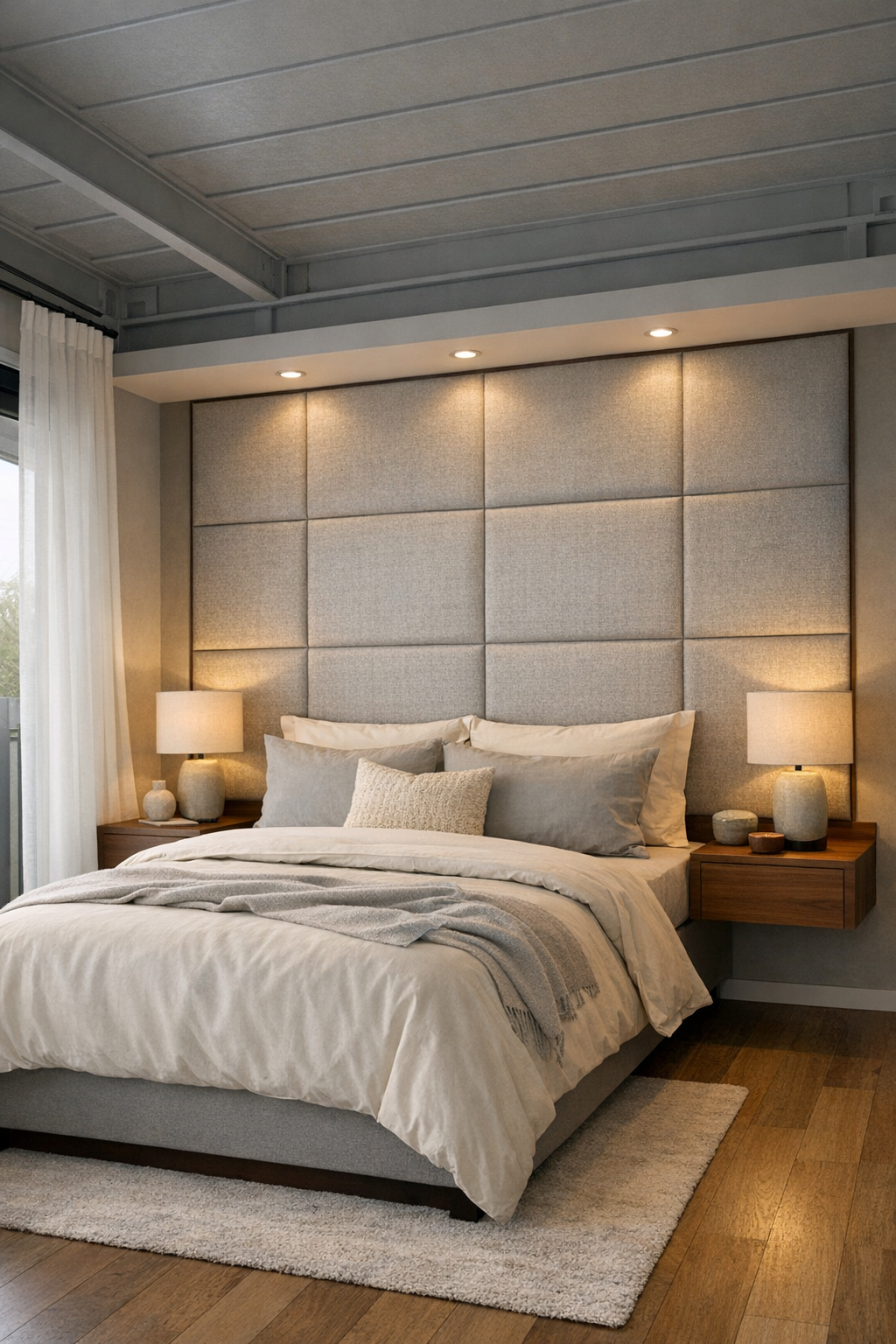
The bedroom takes the home’s quiet palette and makes it even softer. Upholstered wall panels behind the bed create a cocooning effect, while layered bedding in ivory, mushroom, and pale gray gives the room depth without relying on bold color. The furnishings are intentionally low and clean-lined, with floating nightstands and discreet built-in storage that preserve openness around the bed. In a compact footprint, that sense of breathing room matters, and here it is handled with real finesse.
What I find most appealing is the atmosphere. Blackout drapery is paired with lighter sheers so the room can shift from airy morning light to total evening calm, and the lighting plan is gentle rather than dramatic—small pendants, dimmable sconces, and soft perimeter illumination. The textures do most of the work: brushed fabric, warm wood, smooth painted walls, and a subtle woven rug underfoot. It feels restful in a very grown-up way, not overstyled, just deeply comfortable.
Bathroom
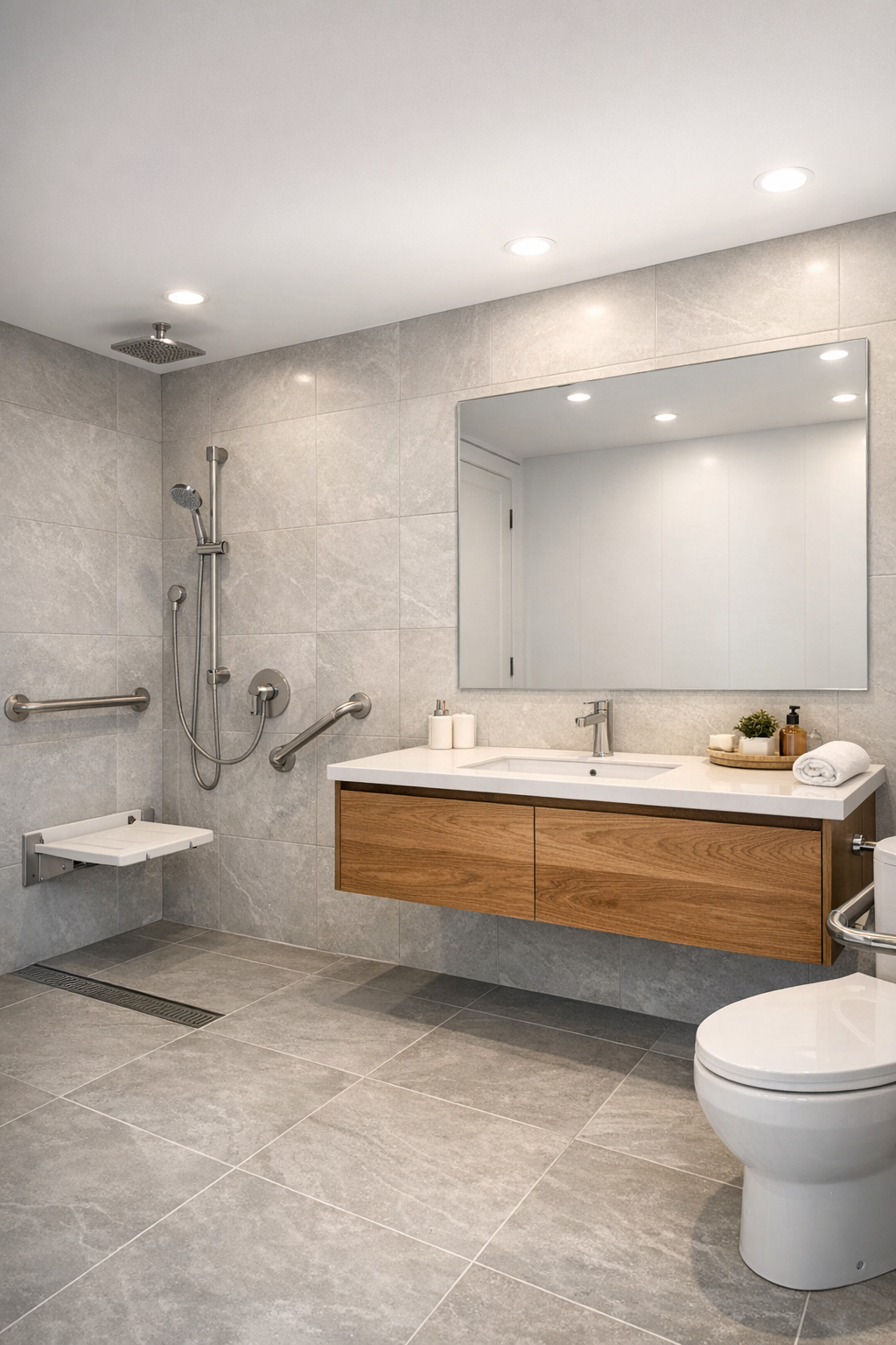
The bathroom is one of the home’s strongest examples of accessibility meeting beauty. A curbless shower with a linear drain extends the floor plane cleanly, making the room feel larger and easier to navigate at once. Large-format porcelain tiles in a warm light gray wrap the walls and floor for a seamless effect, while a floating vanity in natural oak adds welcome warmth. The mirror is broad and simple, the fittings are streamlined, and everything feels placed with intention rather than excess.
I especially like the balance between practicality and spa-like calm. Grab bars are integrated in finishes that match the fixtures, so they read as part of the design language, not visual interruptions. Layered lighting from a backlit mirror and recessed ceiling fixtures keeps the room bright and flattering, and there is enough open floor area to maintain the home’s easy circulation. The whole space feels fresh, sensible, and soothing—exactly what I want a bathroom to be.
Other Areas
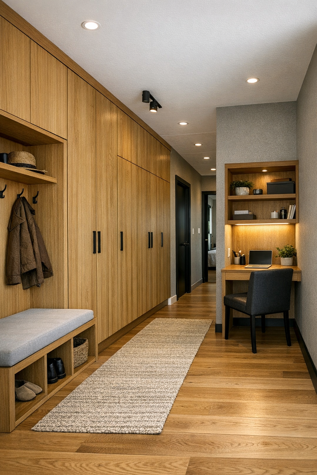
What elevates this home beyond its primary rooms are the transition spaces. The hallway is not treated as leftover square footage; instead, it becomes part of the experience through built-in storage, soft wall lighting, and enough width to feel gracious rather than merely functional. Near the entry, a compact mudroom-style zone includes a bench, concealed cabinetry, and hooks integrated into wood paneling, giving the home a practical landing spot without visual clutter. Even a small work nook is carved out with care, fitted with a floating desk and shelving that feel fully considered.
These supporting spaces carry the same disciplined material language as the rest of the house, which is one reason the whole interior feels so cohesive. Oak, pebble gray paint, black accents, and softly textured textiles repeat from room to room, creating continuity without monotony. I also appreciate how every inch seems to have a purpose. In homes with compact origins, that level of planning makes all the difference, and here it turns circulation zones into useful, attractive parts of daily life.
Why You'd Live Here
You would live here because it proves that compact, sustainable-minded design can still feel generous, elegant, and deeply livable. The accessible layout is not just practical; it shapes a home that moves well, feels calm, and supports real daily routines. Every room has clarity, every finish has a purpose, and nothing feels wasted. That is harder to achieve than it looks, and this house makes it seem effortless.
I also think many people would be drawn to the emotional tone of the place. It is modern without being flashy, minimal without being austere, and highly functional without losing warmth. For anyone who values thoughtful storage, a kitchen that truly works, and rooms that feel easy on the eyes and easy on the body, this home offers a compelling vision of how beautifully intelligent design can improve everyday life.