
This muted olive green accessible container home has the kind of calm presence I always notice first in a good kitchen: nothing is trying too hard, and yet every choice feels deliberate. From the outside, its strong linear form reads crisp and modern, but the palette softens it immediately, settling the house into its setting with a grounded, almost restorative mood. As a concept design, it feels especially successful because it treats accessibility not as an add-on, but as the starting point for beauty, comfort, and ease.
What makes the home special is the way elegance grows out of function. Wide passages, level thresholds, generous turning clearances, and thoughtfully placed storage create an effortless rhythm from one space to the next, while warm woods, matte finishes, and quietly luxurious textiles keep the rooms from feeling clinical. I’m drawn to homes that make daily life smoother without announcing it, and this one does exactly that with a confidence that feels both modern and deeply livable.
Exterior
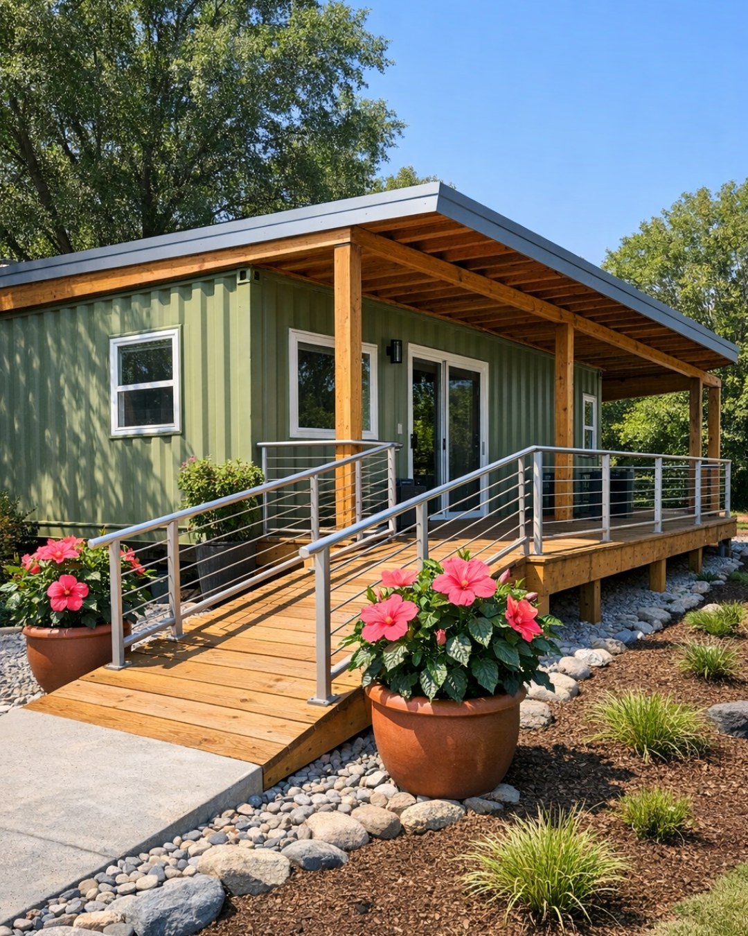
The exterior honors the container structure without letting it dominate the experience. Painted in a muted olive green with a soft matte finish, the cladding has an earthy sophistication that pairs beautifully with blackened steel trim, pale concrete walkways, and warm cedar accents at the entry. The composition is low and horizontal, which gives the home a settled, welcoming posture, and the lines are clean without feeling stark. I like the way the olive tone shifts through the day, reading almost gray in softer light and richer green when the sun catches it.
Accessibility is integrated into the architecture so naturally that it simply reads as good design. A gently sloped approach replaces any sense of formal front steps, and the covered entrance is broad enough to feel protective rather than narrow or utilitarian. Exterior lighting is recessed and discreet, washing the walls and path with even illumination instead of harsh glare. Planters with native grasses and low-maintenance greenery soften the industrial geometry, creating a first impression that is tidy, contemporary, and quietly generous.
Living Room
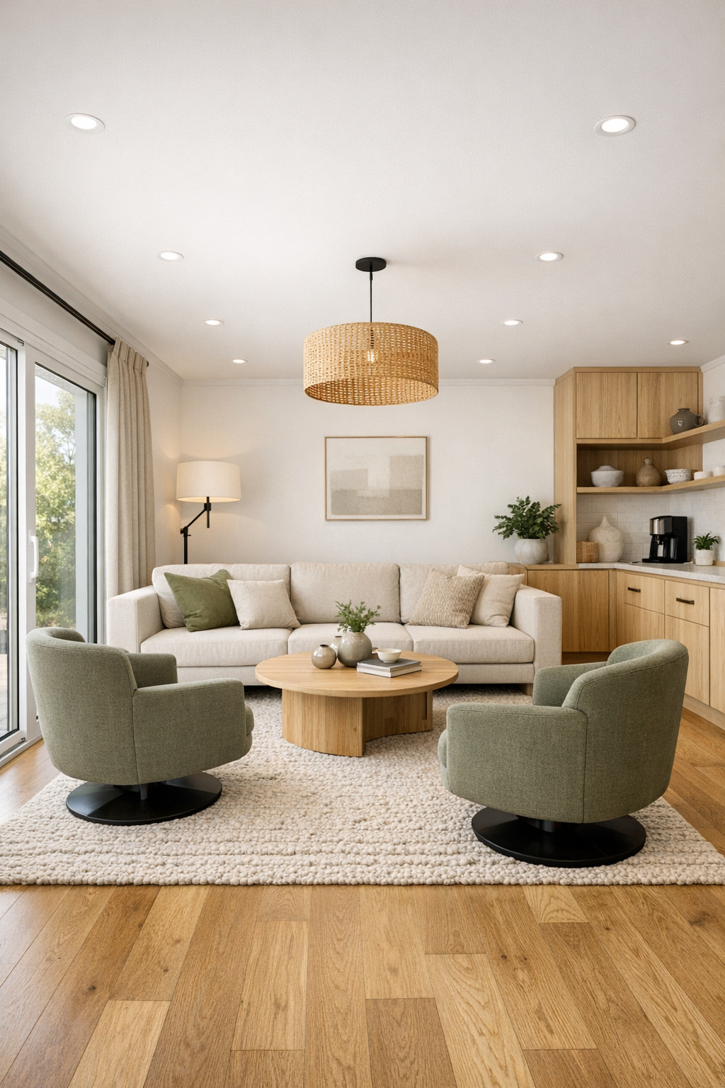
The living room is where the home’s polished restraint really comes into focus. The palette stays close to nature—oatmeal, mushroom, olive, warm white, and a little charcoal—and those tones make the space feel broad and composed. A low-profile sofa with a firm but comfortable seat anchors the room, joined by two swivel chairs that allow for easy movement and conversation. The circulation path remains completely clear, which is one of those practical decisions that also improves the visual calm of a room. Nothing feels crowded, and every piece seems to have been edited for both comfort and reach.
Materially, the room is rich without being busy. A wide-plank oak floor brings warmth, while a textured wool rug adds softness underfoot without a heavy pile that could impede movement. The coffee table has rounded corners and a pedestal base, which I always appreciate in a hardworking space, and the media wall is handled with streamlined millwork in a pale wood veneer that conceals storage beautifully. Lighting is layered with recessed ceiling fixtures, a linen-shaded floor lamp, and a soft wall wash that emphasizes the clean lines of the container shell. The overall feeling is serene, functional, and a little bit tailored, like a room that understands exactly how people actually live.
Dining Room
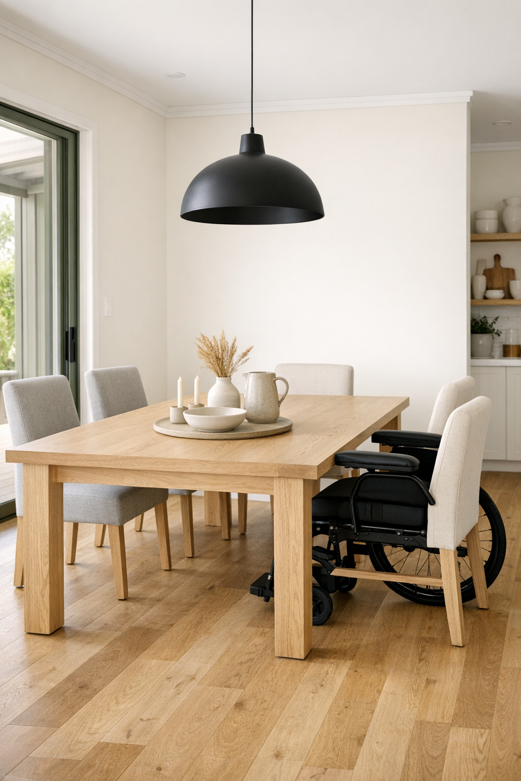
The dining room continues the home’s disciplined simplicity, but with a slightly more intimate tone. Instead of treating it as a separate formal chamber, the layout gives it definition through proportion and lighting, letting it feel connected to the kitchen and living spaces while still holding its own identity. A rectangular dining table in white oak sits at a comfortable height with generous clearance around it, and the chairs are upholstered in a durable woven fabric with supportive backs and easy-to-grip frames. It’s the sort of room that encourages long meals without any fuss.
What I find especially effective here is the restraint in the finishes. A plaster-like wall treatment in warm ivory catches light softly, while a linear pendant in matte black and frosted glass hangs low enough to create atmosphere without obstructing sightlines. The table is styled simply—ceramic serving pieces, a bowl of citrus, maybe a branch or two in a handmade vase—and that spareness suits the architecture. Because the home prioritizes accessibility, the room never feels pinched or overfurnished, and that openness gives every meal a sense of ease I would value day after day.
Kitchen
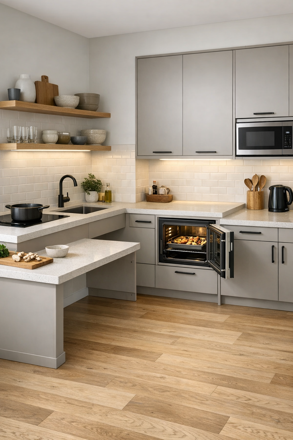
As someone who spends a lot of time thinking about how a kitchen really works, this is the room I linger in most. The layout is wonderfully practical, with lowered and standard-height work surfaces integrated so naturally that the whole composition still feels refined. Cabinetry in a soft greige pairs with white oak open shelving and a pale quartz countertop, and the hardware is slim, matte black, and easy to grasp. There is ample knee clearance at one prep zone, wide space for turning, and appliances placed for convenient access, all without sacrificing the clean, composed look that makes a kitchen pleasant to be in.
The details are smart in the way I most admire: a side-opening wall oven, a shallow sink workstation, pull-out pantry storage, and under-cabinet lighting that eliminates shadows on the counters. The backsplash is a handmade-look ceramic tile in a warm white, giving the room just enough texture to keep it from feeling flat. I can picture cooking here very clearly—setting out spices, chopping herbs, moving from sink to cooktop without strain, and still having the kitchen look beautifully in order at the end of the day. It is elegant, yes, but more importantly it is deeply usable, and that is my favorite kind of luxury.
Bedroom
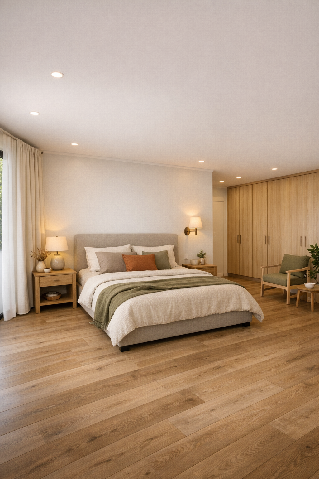
The bedroom shifts the mood slightly softer, which feels exactly right. The lines remain clean, but the textures become more enveloping: an upholstered bed in a warm flax tone, crisp cotton bedding layered with a quilted coverlet, and full-height drapery in a muted natural fabric that frames the windows without visual heaviness. There is ample space around the bed for easy movement, and the furniture is intentionally modest in scale, which helps the room feel restful rather than overdesigned.
I especially like the way storage is handled here. Built-in wardrobes with touch-latch or elongated pulls keep the walls visually quiet, and integrated bedside ledges replace bulkier tables that might interrupt circulation. The lighting is soft and thoughtful, with dimmable sconces, concealed cove lighting, and a gentle ceiling glow that avoids the flatness bedrooms sometimes get. The color palette leans toward warm neutrals with just a hint of olive and clay, making the room feel grounded, private, and easy to settle into at the end of a long day.
Bathroom
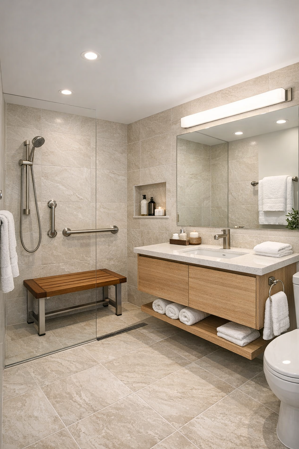
The bathroom may be one of the best examples of how this home turns practical needs into visual strengths. A curbless shower extends the sightline and makes the room feel larger, while large-format porcelain tile in a pale stone finish keeps the surfaces quiet and cohesive. There is a floating vanity with rounded edges, an easy-to-clean integrated sink, and a broad mirror that reflects light across the room. Supportive features are present, of course, but they are selected in finishes that blend with the rest of the palette, so the room reads as spa-like rather than institutional.
Texture does a lot of work here. Ribbed glass, brushed nickel fittings, soft white towels, and a slatted teak shower bench introduce warmth and variation against the smoother tile planes. Good bathroom lighting can be surprisingly hard to get right, and this one handles it beautifully with a combination of diffuse overhead light and flattering vertical fixture lighting at the mirror. The result is bright, clean, and composed, with enough warmth to feel personal. It is a bathroom designed for comfort and dignity, and that comes through in every finish and proportion.
Other Areas
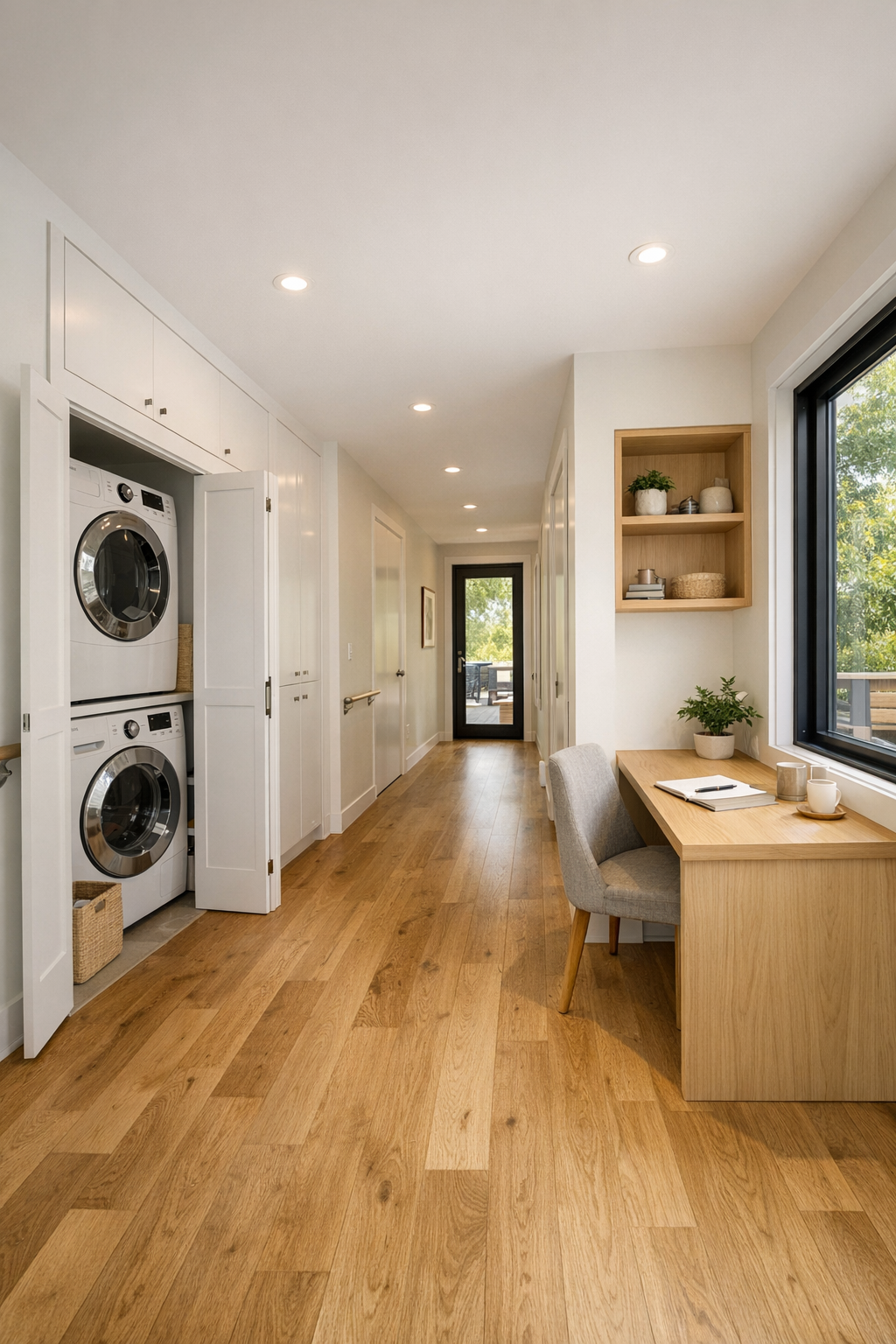
Beyond the main rooms, the supporting spaces are handled with an intelligence I truly appreciate. The hallway is not just a connector but a comfortable circulation zone, wide enough to feel gracious and finished with the same oak flooring and warm white walls used throughout. A compact laundry area is concealed behind paneled doors, with front-access appliances, pull-out sorting bins, and shelving that makes everyday chores easier. Even small transitions—between entry, storage, and utility areas—are designed to remain level, open, and visually consistent.
There is also room for a flexible nook that could work as a home office, reading corner, or compact breakfast spot, depending on what life requires. I imagine a simple desk in pale wood, a supportive chair, open shelving for cookbooks and baskets, and a window that brings in steady natural light. These secondary spaces often reveal whether a home has really been thought through, and here they absolutely have. Nothing feels leftover. Every zone supports the larger promise of the house: style that serves daily living with quiet competence.
Why You'd Live Here
You would live here because it proves that accessibility can be beautiful at every scale, from the broad architectural moves down to the smallest hardware choice. The home is efficient without feeling compressed, minimal without feeling cold, and elegant without losing sight of the ordinary routines that shape daily life. I think that balance is rare.
More than anything, this container home offers clarity. It knows what it wants to be: calm, functional, resilient, and comfortable. If you value thoughtful design, easy movement, and rooms that support cooking, gathering, resting, and simply getting through the day with less friction, this is the kind of home that makes a very strong case for itself.