
I have a soft spot for homes that manage to feel both inventive and deeply livable, and this dusty rose container home does exactly that. Set up with an accessible, easy-flow layout and a warm modern style, it blends clean architectural lines with a surprisingly gentle personality. The rosy exterior gives it a welcoming first impression, but inside, the mood shifts into something even better: calm, bright, tactile, and thoughtfully composed for everyday life.
Even as a concept design, it feels grounded in the kinds of details that really matter when life gets busy: wide passages, comfortable turning space, durable finishes, and rooms that don’t sacrifice beauty for practicality. As someone who spends a lot of time thinking about how a home supports the daily rhythm of cooking, working, and unwinding, I was immediately drawn to the way this one balances accessibility with warmth in such a natural, unfussy way.
Exterior
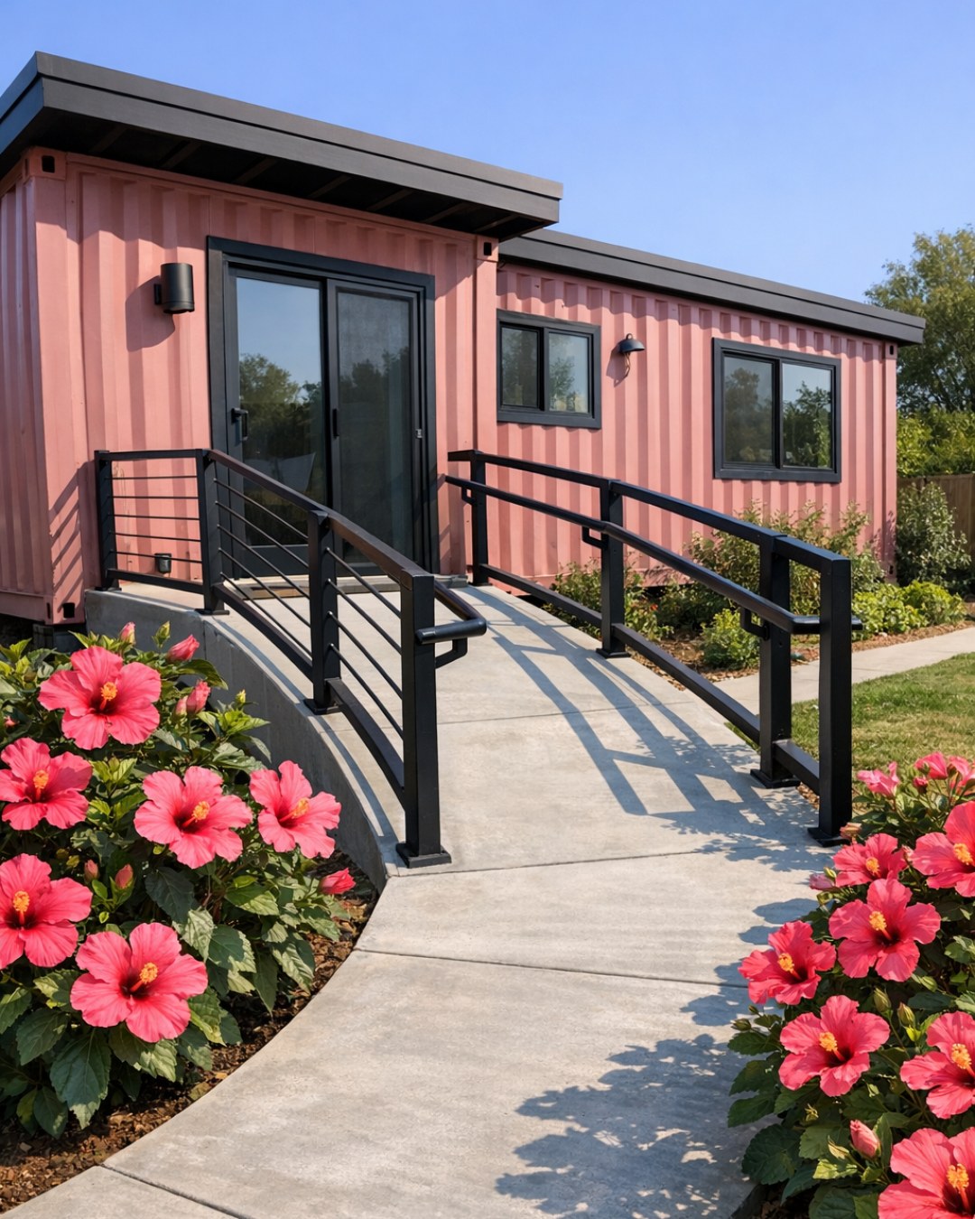
From the outside, the home makes a strong case for container architecture feeling soft instead of stark. The dusty rose finish transforms the corrugated steel into something almost velvety from a distance, especially when paired with matte black window frames and pale concrete walkways. The massing is low and linear, which helps the structure feel approachable, and the entry sequence is handled beautifully with a gently sloped path, integrated planters, and a covered front approach that reads more boutique retreat than industrial experiment.
I especially like how the exterior materials are edited rather than overworked. There’s the painted steel, warm-toned wood cladding at recessed portions, simple rail details, and enough landscaping to soften the edges without hiding the architecture. Ornamental grasses, low shrubs, and a few small trees give it movement and seasonality, while generous glazing hints at the light-filled interior. The whole composition feels intentional and easy to maintain, which, honestly, is always a win in my book.
Living Room
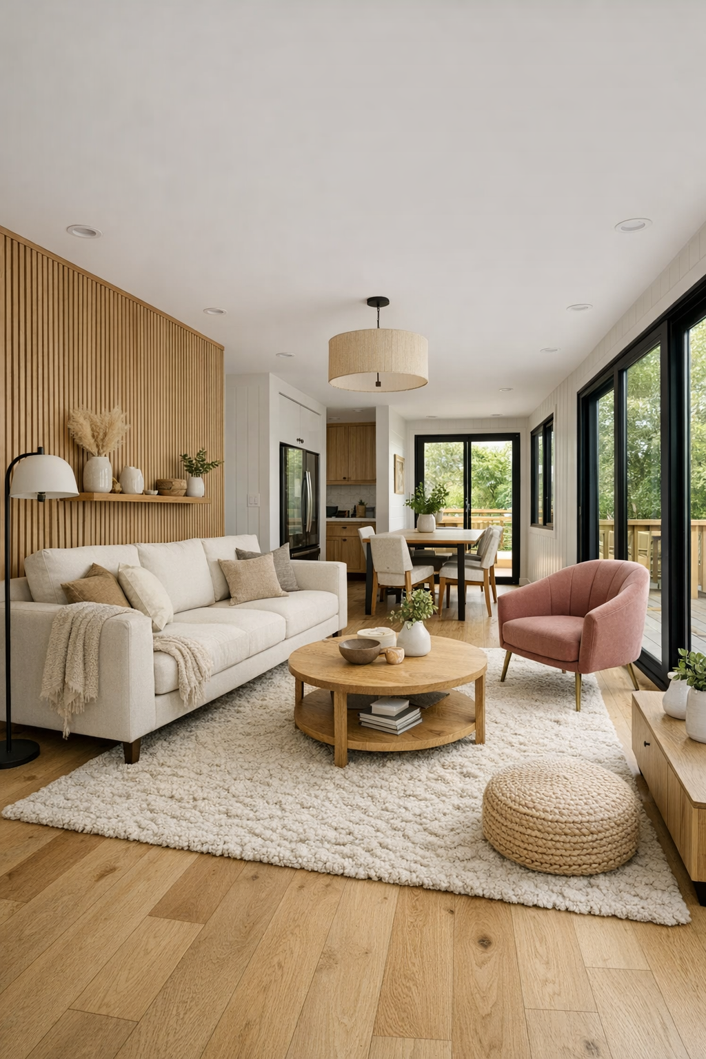
The living room leans into a serene palette that lets the architecture breathe. Soft ivory walls, white oak flooring, and sandy linen upholstery create a light, open backdrop, while the dusty rose from the exterior reappears in subtle accents like a boucle lounge chair, a woven throw, and a large abstract textile on one wall. Because the footprint is rooted in container dimensions, the design uses every inch well: a streamlined sofa faces a low media console, circulation paths stay wide and clear, and the furniture arrangement preserves openness without feeling sparse.
What really makes this room sing is the layering of texture. Ribbed wood paneling warms one focal wall, a chunky wool rug softens the floor, and a mix of ceramic lamps, matte metal side tables, and nubby fabrics keeps the space from feeling flat. Natural light pours in through oversized windows, and in the evening, recessed ceiling lighting works alongside wall sconces and a floor lamp to create a gentle glow. It feels like the kind of room where you could answer emails with coffee in the morning and still want to curl up there after dinner.
Dining Room
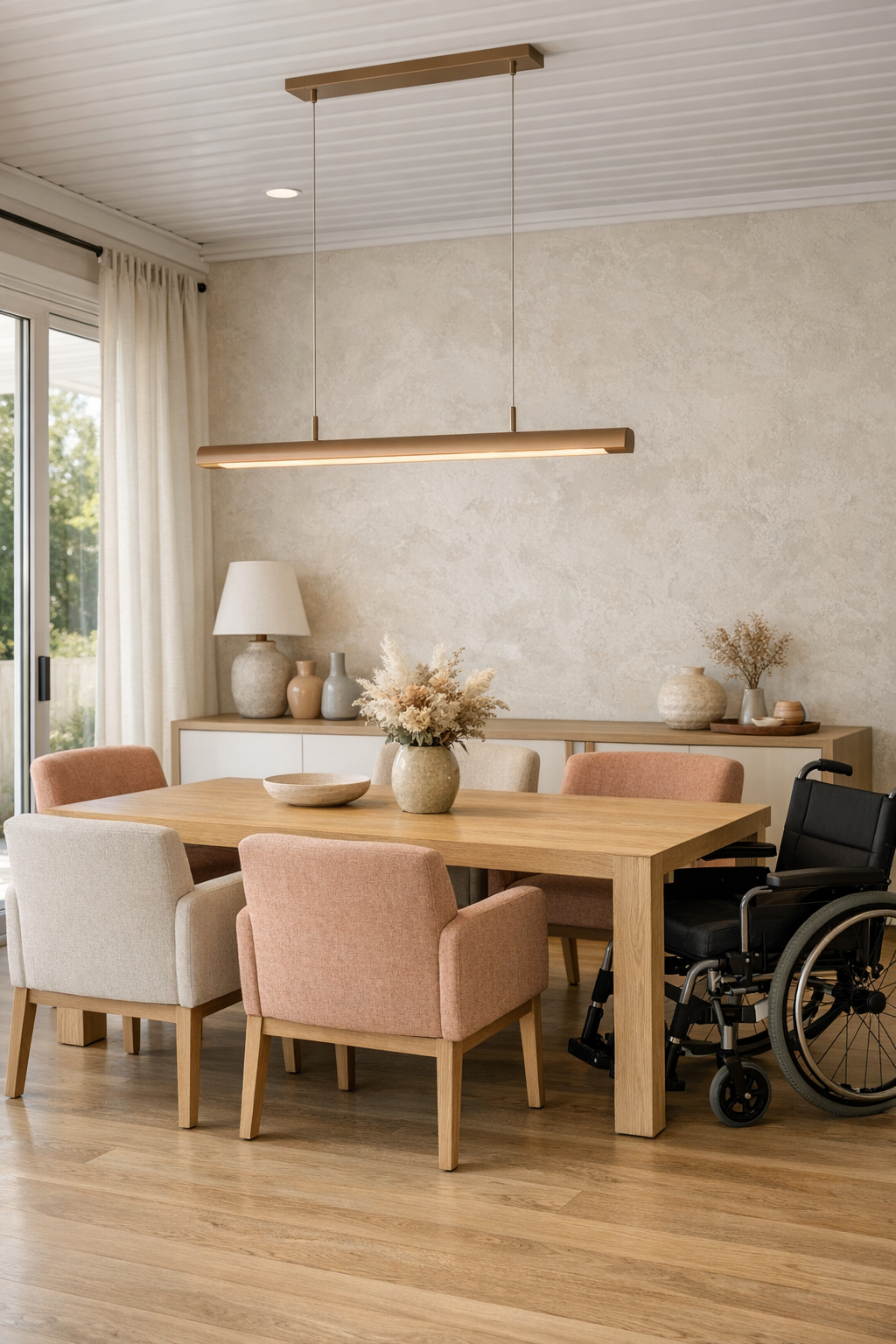
The dining room sits comfortably between the living area and kitchen, and I love how connected it feels without losing its own identity. A rounded rectangular dining table in pale oak anchors the space, surrounded by upholstered chairs with supportive arms and enough spacing to keep movement easy. That choice alone makes the room feel more inclusive and more relaxed. Overhead, a linear pendant in a soft bronze finish adds structure while still keeping sightlines clean.
The styling here is minimal but not cold. A plaster-finish wall adds a subtle hand-troweled texture, and a low sideboard brings in practical storage for serving pieces, linens, and all the things I like to keep within reach when hosting. The color story stays beautifully cohesive, with oatmeal, blush, clay, and warm wood tones doing most of the work. It’s easy to picture a weeknight pasta dinner here just as clearly as a holiday spread, which tells me the room has been designed with real life in mind.
Kitchen
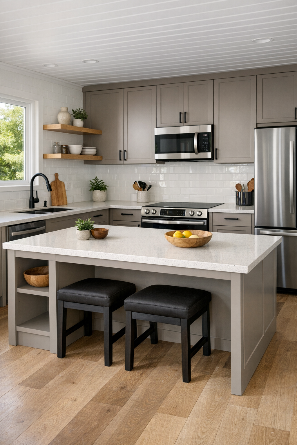
The kitchen is where this home really wins me over. It’s practical in all the right ways, with a highly efficient layout, lowered and varied work surfaces, generous clearance, and easy-to-reach storage that feels thoughtfully integrated rather than clinical. Flat-panel cabinetry in a warm mushroom tone pairs with white oak open shelving and a pale quartz countertop, while the backsplash in glossy handmade-look tile brings just enough sheen to bounce light around the room.
I can already imagine doing Sunday meal prep here, because everything about it feels easy to use. The island is designed with seating on one side and open knee space on another, making it flexible for cooking, chatting, or helping with homework while dinner gets started. Matte black hardware gives the room a crisp edge, and integrated appliances keep the overall look quiet and seamless. Under-cabinet lighting, a large window over the sink, and a couple of small styling moments like a ceramic fruit bowl and wood cutting boards make it feel polished but still completely approachable.
Bedroom
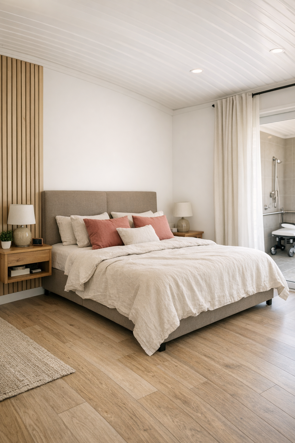
The bedroom takes the home’s soft modern language and turns the volume down even further. Here, the palette becomes hushed and cocooning, with warm white walls, natural linen bedding, muted rose accent pillows, and a beautifully upholstered headboard in a sandy taupe fabric. The layout prioritizes ease of movement, with clear floor space around the bed and nightstands that are simple, open, and easy to access. Nothing feels crowded, and that sense of calm is one of the room’s biggest luxuries.
I also appreciate how the materials do so much of the emotional work. There’s a woven bench at the foot of the bed, light-filtering drapery that softens the industrial window frames, and a subtle wood slat detail behind the headboard that adds warmth without making the room busy. Lighting is especially well handled, with soft overhead illumination, swing-arm sconces for reading, and enough ambient glow to make the space feel restful at every hour. It’s the kind of bedroom that makes you want to put your phone down a little earlier.
Bathroom
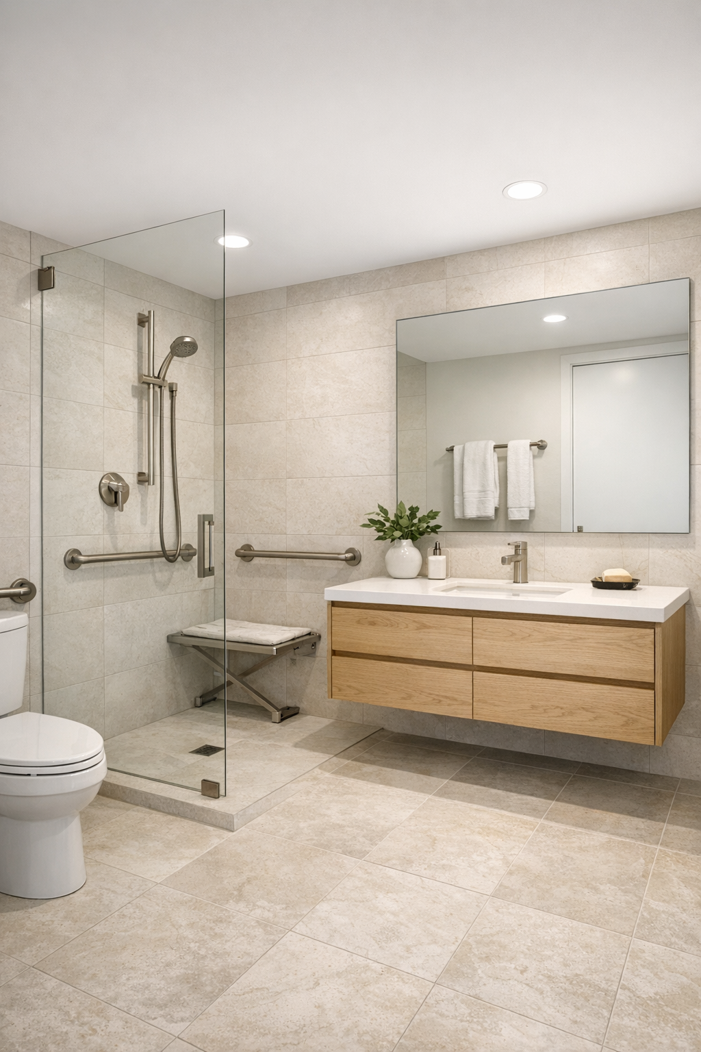
The bathroom is one of the best examples of how accessibility and style can work hand in hand. A curbless shower with a frameless glass partition keeps the room visually open, while large-format porcelain tile in a pale limestone tone gives the entire space a clean, grounded feel. There’s a floating vanity in white oak, a wide mirror that amplifies light, and streamlined fixtures in brushed nickel that feel timeless rather than trendy.
What I find especially successful is the balance of softness and utility. A built-in shower bench, thoughtful grab bar placement, and easy-maintenance surfaces are integrated so elegantly that nothing disrupts the overall aesthetic. The lighting is bright where it needs to be and flattering everywhere else, thanks to a combination of vertical mirror lights and recessed ceiling fixtures. Add in plush cotton towels, a niche for bath essentials, and a little greenery, and the room lands squarely in that sweet spot between spa-like and sensible.
Other Areas
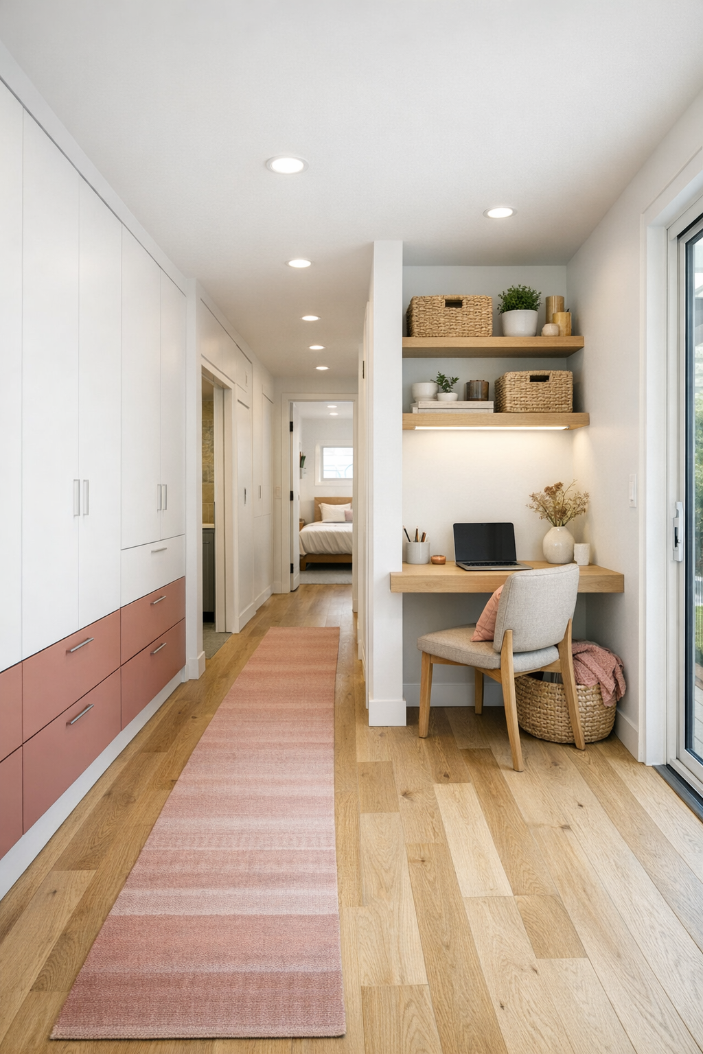
Beyond the main rooms, this home continues to impress in the smaller transition spaces that often get overlooked. The hallway is wide and bright, with built-in storage that sits flush to the wall and keeps clutter under control. A compact home office nook includes a floating desk, open shelving, and excellent task lighting, making it ideal for a work-from-home setup without needing a fully separate room. Near the entry, there’s also a mudroom-style drop zone with a bench, hooks, and closed cabinetry, which is exactly the kind of practical feature I always appreciate after a long day.
One of my favorite touches is how these secondary areas still feel fully designed. The same white oak flooring and dusty rose accents carry through, tying the whole home together, while durable materials make the everyday wear and tear feel manageable. Even the laundry area is elevated with stacked appliances, folding space, and good storage, which honestly feels like a little luxury when you’re juggling work, errands, and dinner plans. It all reinforces the idea that thoughtful design isn’t just about statement rooms; it’s about making every corner work beautifully.
Why You'd Live Here
You’d live here because it proves that a compact, innovative home can still feel warm, polished, and completely supportive of everyday routines. The accessible layout isn’t treated as an afterthought; it shapes the home in ways that make life smoother, more comfortable, and more beautiful. Every room is easy to move through, easy to maintain, and easy to imagine yourself in, which is harder to achieve than it looks.
For me, the biggest draw is how effortlessly this home blends smart planning with genuine charm. It has personality from the very first glance, thanks to that dusty rose exterior, but the interior is what really stays with you: the soft materials, the natural light, the practical kitchen, and the calm, cohesive palette. It feels like a home designed for real mornings, real messes, real meals, and real rest, and that’s exactly what makes it so breathtaking.