
This accessible container home has the kind of quiet confidence I always fall for right away. From the outside, its stacked geometry feels crisp and modern, but the interior softens every edge with warm wood, creamy plaster tones, and sunlight that seems to linger across every surface. Set as if it belongs at the edge of a meadow just beyond the bustle of town, it balances practicality with beauty in a way that feels especially fresh.
What makes this place stand out to me is how thoughtfully it turns an industrial shell into something deeply welcoming, all while keeping circulation easy and comfortable. As a concept design, it still feels wonderfully livable: open sightlines, generous passage widths, flush transitions, and rooms that never sacrifice style for function. It is the kind of home I can picture stepping into after a long workday and instantly exhaling.
Exterior
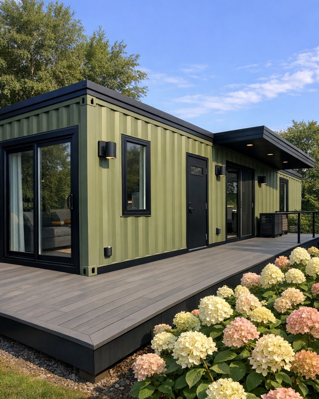
The exterior leans into the clean lines of container architecture without feeling cold. The metal cladding is finished in a soft charcoal with a matte texture that keeps the home grounded, while sections of thermally treated cedar add warmth and rhythm across the façade. I love the way the low-slope roofline and broad overhangs make the house feel calm and horizontal, especially paired with expansive black-framed windows that reflect the sky and pull daylight deep inside.
Accessibility is handled with a kind of elegance that makes it feel completely integrated into the design. A wide, gently sloped walkway replaces the usual front steps, bordered by native grasses and simple poured-concrete pads that keep the approach neat and intuitive. The covered entry has enough depth to feel sheltered in every season, and the oversized front door makes a strong first impression without looking oversized or clinical. Everything feels intentional, streamlined, and easy to move through.
Living Room
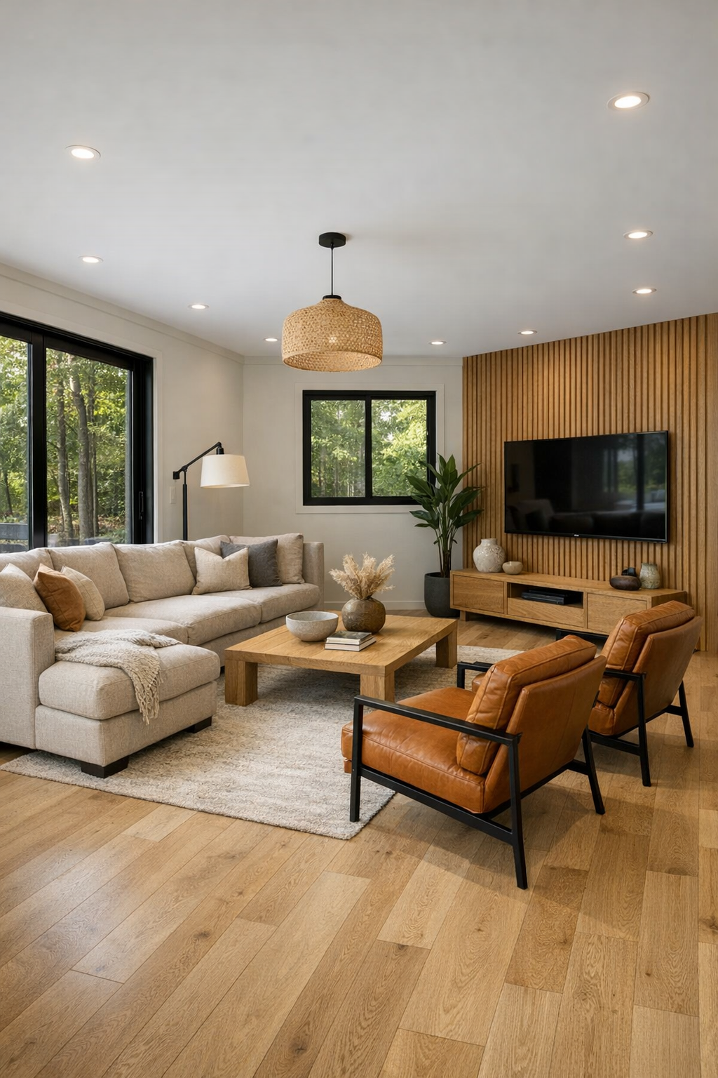
The living room is one of those spaces that instantly reads as both stylish and usable, which is honestly my favorite combination. The palette stays light and steady with pale oak floors, soft ivory walls, and a sandy linen sectional arranged to keep pathways wide and natural. A pair of rounded accent chairs in warm caramel leather brings in just enough contrast, and the shapes matter here: softer silhouettes make the room feel more inviting while also making circulation less awkward. A low oak coffee table with eased edges anchors the center without visually cluttering the floor plan.
What really gives this room its personality is the layering. There is a large textured wool rug in a warm oatmeal tone, open shelving with ceramics and cookbooks, and a sleek media wall wrapped in fluted wood that adds depth without fussiness. The lighting is especially well considered, with recessed ambient lighting, a sculptural floor lamp tucked beside the sofa, and sunlight pouring in through broad sliding doors. It feels like the kind of room where I could answer emails in the morning, throw on a soup in the kitchen, and still have a cozy place to land by evening.
Dining Room
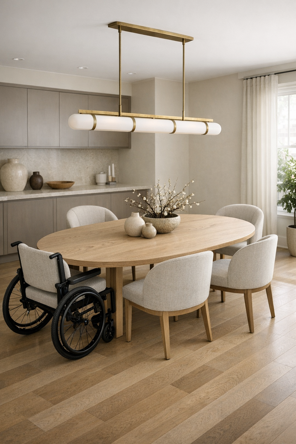
The dining area flows directly off the living space, but it still feels distinct thanks to a beautiful shift in texture and proportion. A long oval dining table in natural ash sits at the center, giving everyone plenty of space to gather while keeping corners easy to move around. The chairs are upholstered in a soft woven fabric with supportive curved backs, and I can absolutely imagine lingering here over a casual weeknight pasta or a Sunday brunch that goes longer than planned.
Above the table, a linear pendant in aged brass and milk glass gives the room a gentle glow rather than a harsh spotlight, which I always appreciate in a dining space. One wall is fitted with a built-in sideboard in muted taupe, topped with a slab of pale stone for serving dishes, candles, or a tray of drinks. The whole room is simple but polished, with enough open space around the table to feel graceful instead of tight. It has that rare quality of being ready for guests while still feeling easy enough for everyday life.
Kitchen
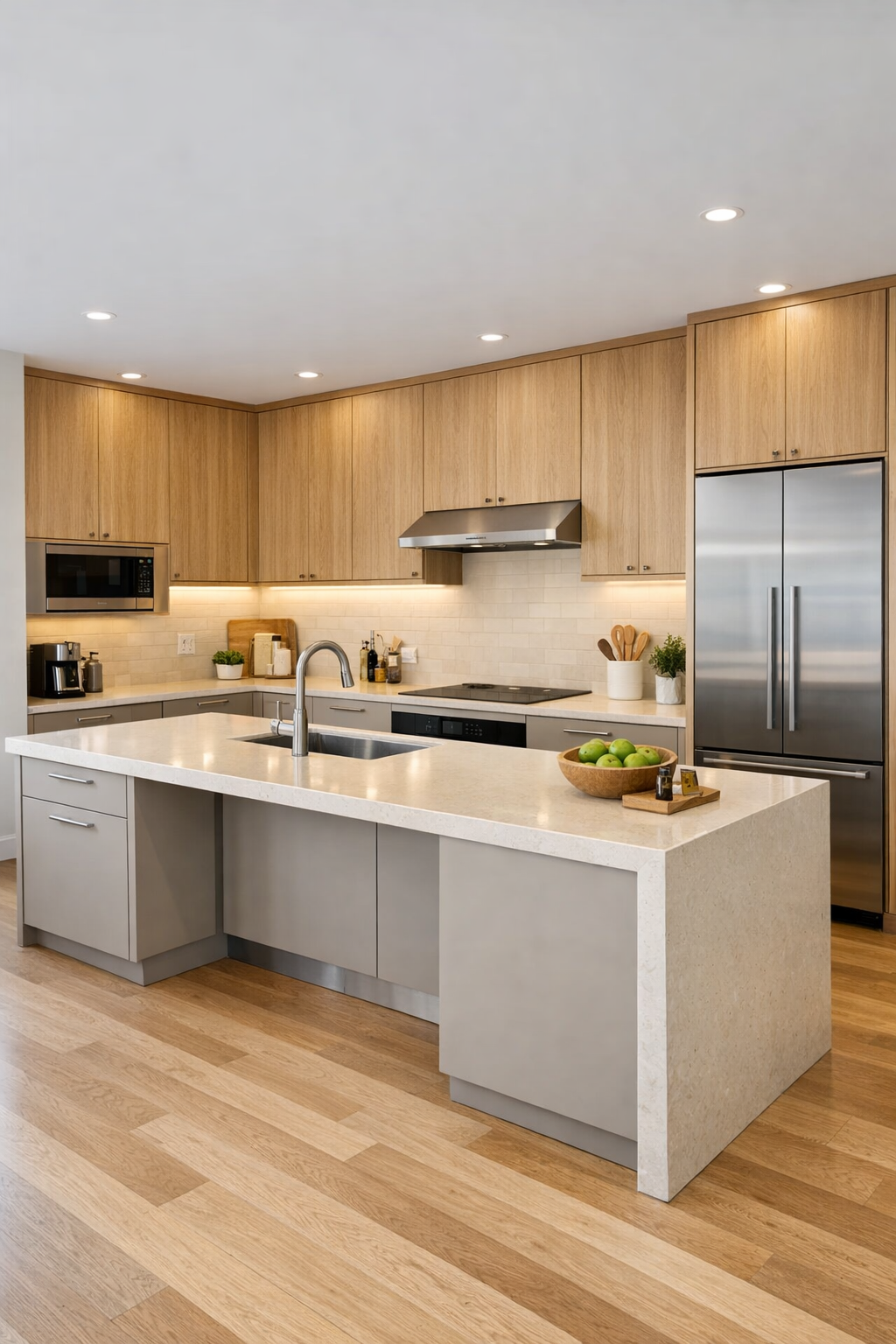
The kitchen is, not surprisingly, the space I was most excited to see, and it absolutely delivers. It is designed with a generous, open layout that makes movement easy from every angle, with broad walkways and an island that allows for both prep and seating without squeezing the room. The cabinetry is a mix of smooth matte putty-toned lowers and white oak uppers, which keeps the overall look warm but not heavy. A waterfall-edge quartz island in a creamy off-white gives the room a polished centerpiece, while integrated pulls and hidden storage keep everything visually calm.
I especially love the practical details here because they are the sort of things that make daily routines easier without announcing themselves. There are varying counter heights for comfort and flexibility, under-cabinet lighting that brightens the work surface beautifully, and a wall of tall pantry storage that would make meal prep feel so much more manageable on a busy weeknight. The backsplash is a handmade-look tile in a soft bone color, and the appliances are sleek, front-accessible, and seamlessly built in. It feels like a kitchen built for real cooking, real schedules, and a lot of joyful use.
Bedroom
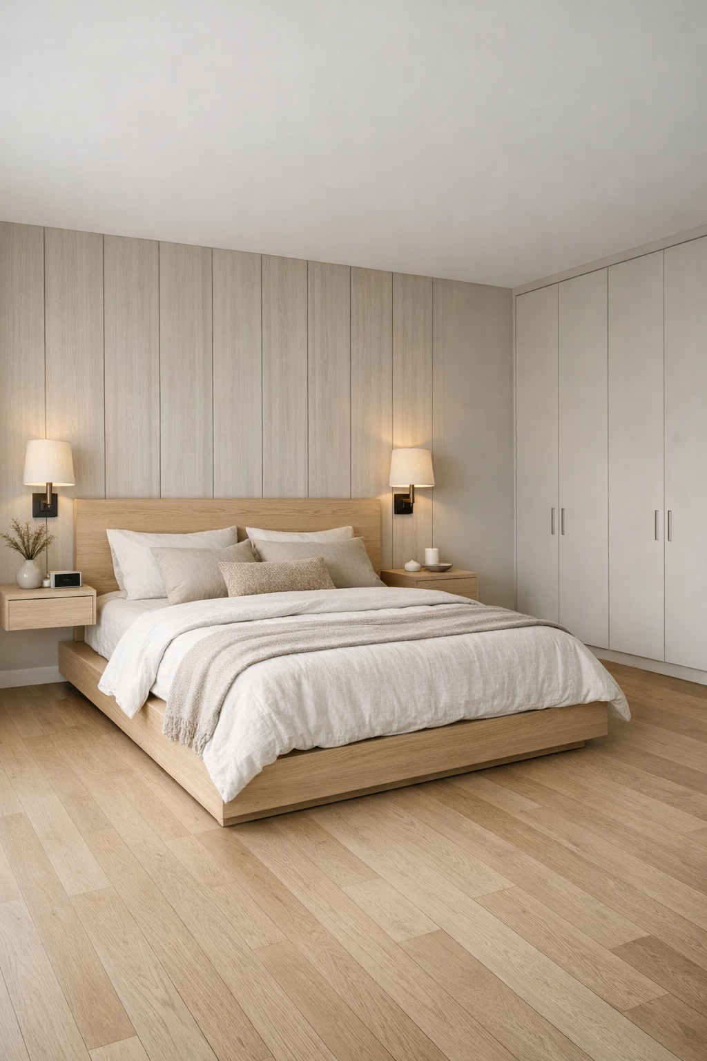
The bedroom takes a slightly quieter turn, which feels exactly right. The palette shifts into softer mushroom, flax, and warm white tones, creating a restful backdrop that lets texture do most of the work. A low platform bed in white oak sits against a paneled headboard wall, layered with crisp cotton bedding, a quilted coverlet, and oversized pillows in muted earth tones. There is plenty of clearance around the bed, and that extra openness gives the room a calm, uncluttered feeling that I think so many bedrooms try to achieve but do not always manage.
Instead of crowding the room with too much furniture, the design keeps things focused and breathable. Simple floating nightstands, slender sconces with dimmable light, and a soft wool area rug make the space feel finished without weighing it down. Across from the bed, a built-in wardrobe wall hides storage behind flat, handle-free panels, keeping the lines uninterrupted. It is restful in a very real way, not just pretty for photos, and I can picture this being the sort of bedroom where you finally remember what it feels like to fully unwind.
Bathroom
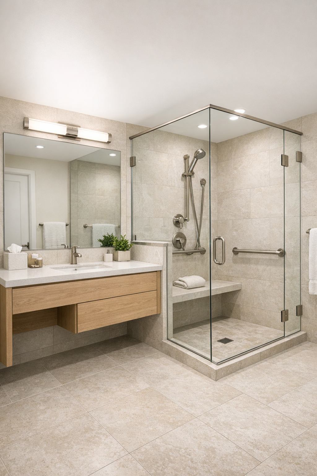
The bathroom is where the home’s accessible thinking and design polish come together especially well. Large-format porcelain tile in a pale limestone tone runs continuously across the floor and up select walls, giving the room a seamless, expansive look. A floating vanity in light oak with integrated drawer pulls keeps the floor visible and open, while a wide quartz countertop and oversized mirror make the whole room feel brighter and larger. The palette is airy but not stark, which makes such a difference in a room that can otherwise tip too clinical.
The shower is beautifully done, with a curbless entry, clear glass panel, built-in bench, and a recessed niche lined in subtly textured tile. Brushed nickel fixtures keep the look understated, and layered lighting at the vanity and ceiling ensures the space works well at any time of day. I also appreciate the thoughtful extras, like easy-reach storage and the generous turning space that never interrupts the visual flow. It is a bathroom that feels spa-like in the most grounded, practical sense.
Other Areas
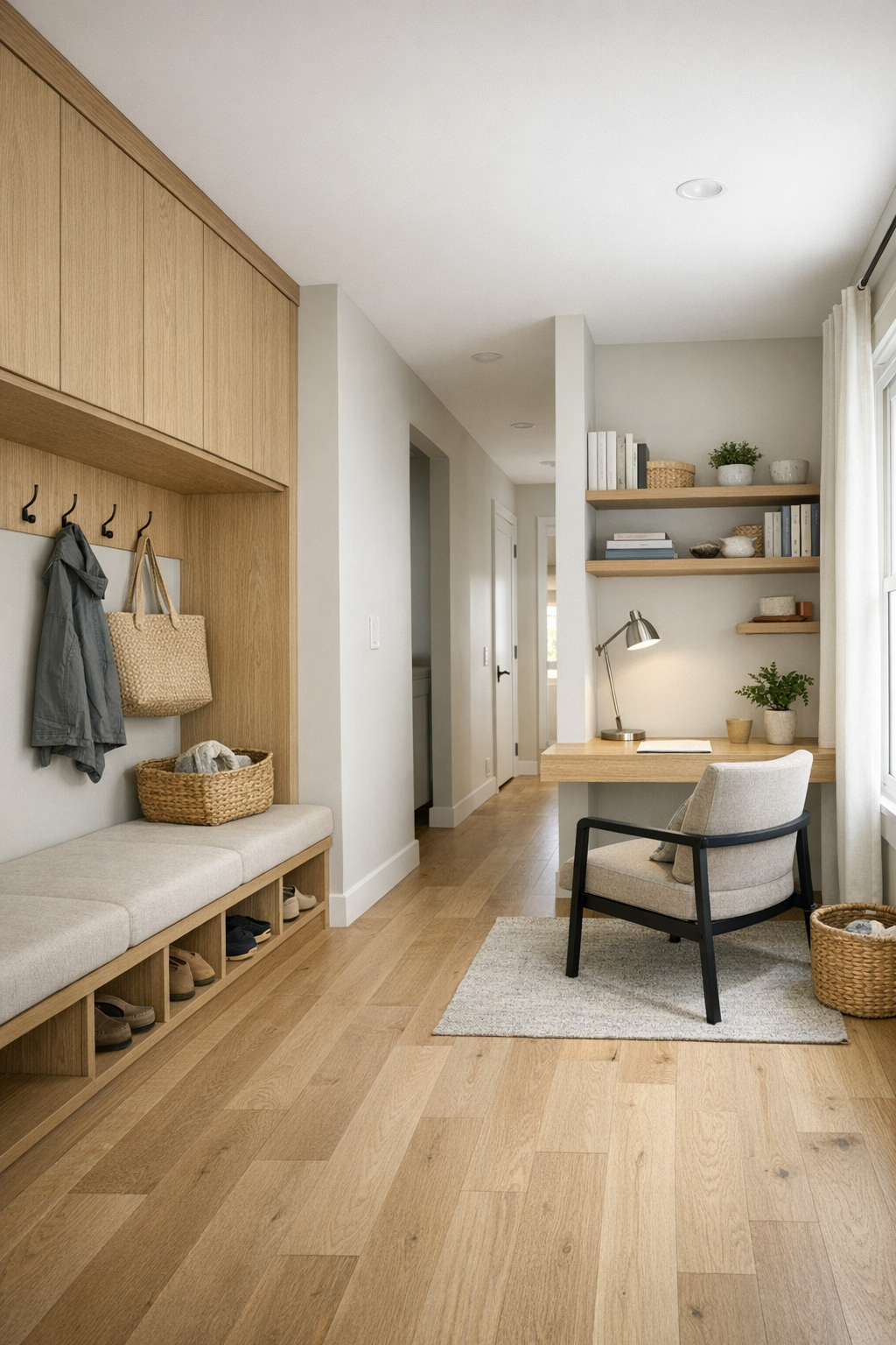
Some of my favorite moments in this home are actually the transitional spaces, because they are designed with as much care as the main rooms. The hallway is wide and naturally lit, with flush thresholds, simple art ledges, and a continuous run of oak flooring that visually connects the entire home. Near the entry, a built-in bench and storage wall create a hard-working drop zone for coats, shoes, and bags without turning the area into a clutter magnet, which, honestly, is the dream.
There is also a flexible nook that could easily serve as a home office, reading corner, or compact hobby space. It is fitted with a floating desk, open shelving, and a comfortable chair placed near a window, so it gets that lovely kind of light that makes even routine tasks feel less draining. In a home like this, those in-between spaces matter so much because they support real daily life. They help the house feel complete, not just styled.
Why You'd Live Here
This home works because it never treats accessibility as separate from beauty. Every room feels cohesive, warm, and highly considered, with materials that soften the industrial roots of the container structure and a layout that supports easy movement from one space to the next. I think that balance is what makes it so memorable: it is modern, but not cold; practical, but not plain.
If you want a home that feels manageable, polished, and genuinely comfortable to live in, this one makes a strong case for doing more with less square footage and more thoughtfulness. I can see it appealing to anyone who wants design that keeps up with real life, whether that means busy workdays, frequent cooking, overnight guests, or simply wanting a space that feels easy the minute you walk through the door.