
This soft clay accessible container home has a grounded, welcoming presence that I immediately love. From the outside, the architecture keeps the crisp lines of container construction, but everything is softened by a warm clay-toned finish, gentle landscaping, and a layout that feels open rather than industrial. The overall mood is calm, practical, and beautifully lived-in, with wide passages, easy transitions, and a natural palette that gives the whole place a sense of ease.
What makes this home special is how thoughtfully it balances style with everyday comfort, especially for family life and gathering around food. Even as a concept design, it feels deeply believable to me: a home where you can move around freely, set out snacks for kids and friends, and still enjoy materials and details that feel elevated. It has that rare quality of being both streamlined and warm, and I think that is exactly what makes it so memorable.
Exterior

The exterior composition celebrates the modular rhythm of container architecture while softening it with color and texture. A matte clay finish wraps the metal structure in a warm, earthy tone that shifts beautifully in daylight, and blackened steel trims add definition without making the home feel harsh. The entry approach is especially inviting, with a gently sloped path, flush thresholds, and broad landings that make the arrival feel gracious and effortless. Low native grasses and pale stone ground the home in the landscape, giving the clean geometry something organic to rest against.
I also appreciate how the home avoids looking overly severe, which can happen with container builds. Deep overhangs create pockets of shade, large windows break up the massing, and wood soffits bring in a note of natural softness that hints at the interior palette. There is a sheltered outdoor sitting area that feels genuinely usable, not just decorative, and it extends the home’s sense of hospitality. Altogether, the exterior promises exactly what the inside delivers: accessibility, warmth, and a design language that feels modern without forgetting how people actually live.
Living Room
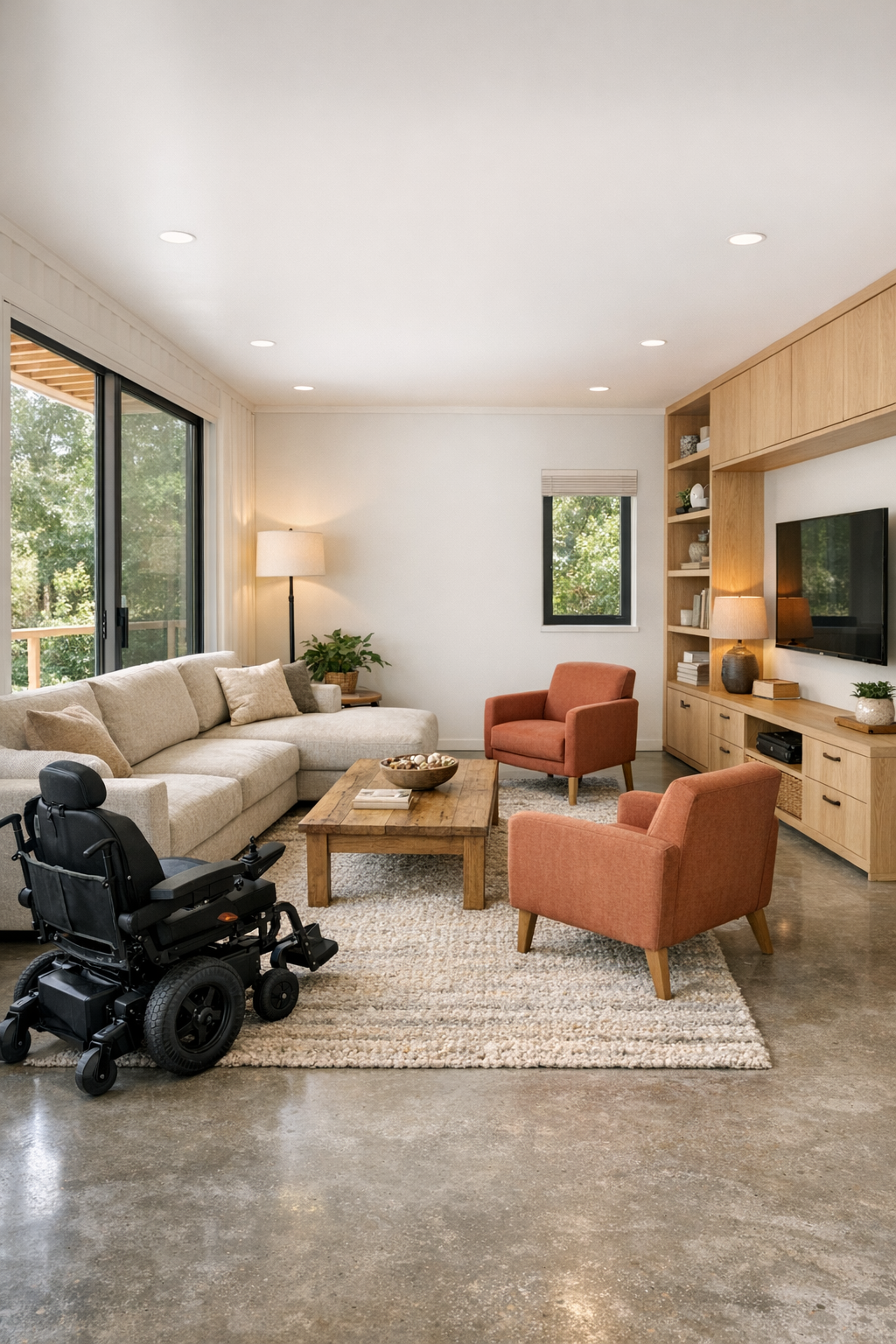
The living room is where the home’s warmth really settles in. A low-profile sectional in oatmeal performance fabric anchors the space, paired with rounded accent chairs in a muted terracotta that quietly echo the clay exterior. The circulation around the furniture is wonderfully open, with enough room to move comfortably from one zone to another without squeezing past sharp corners or oversized pieces. Underfoot, a large textured wool rug in sand and cream softens the polished concrete floor and gives the room the kind of coziness that makes people want to stay awhile.
What I find especially successful here is the mix of clean architecture and family-friendly texture. Pale oak millwork stretches along one wall, incorporating open shelving, concealed storage, and a media console in one continuous line, which keeps the room tidy and visually calm. Layered lighting does a lot of work too: slim recessed fixtures provide even illumination, while a pair of ceramic table lamps and a softly glowing floor lamp add that evening warmth I always look for in a gathering space. It feels polished, but not precious, which is my favorite kind of room.
Dining Room
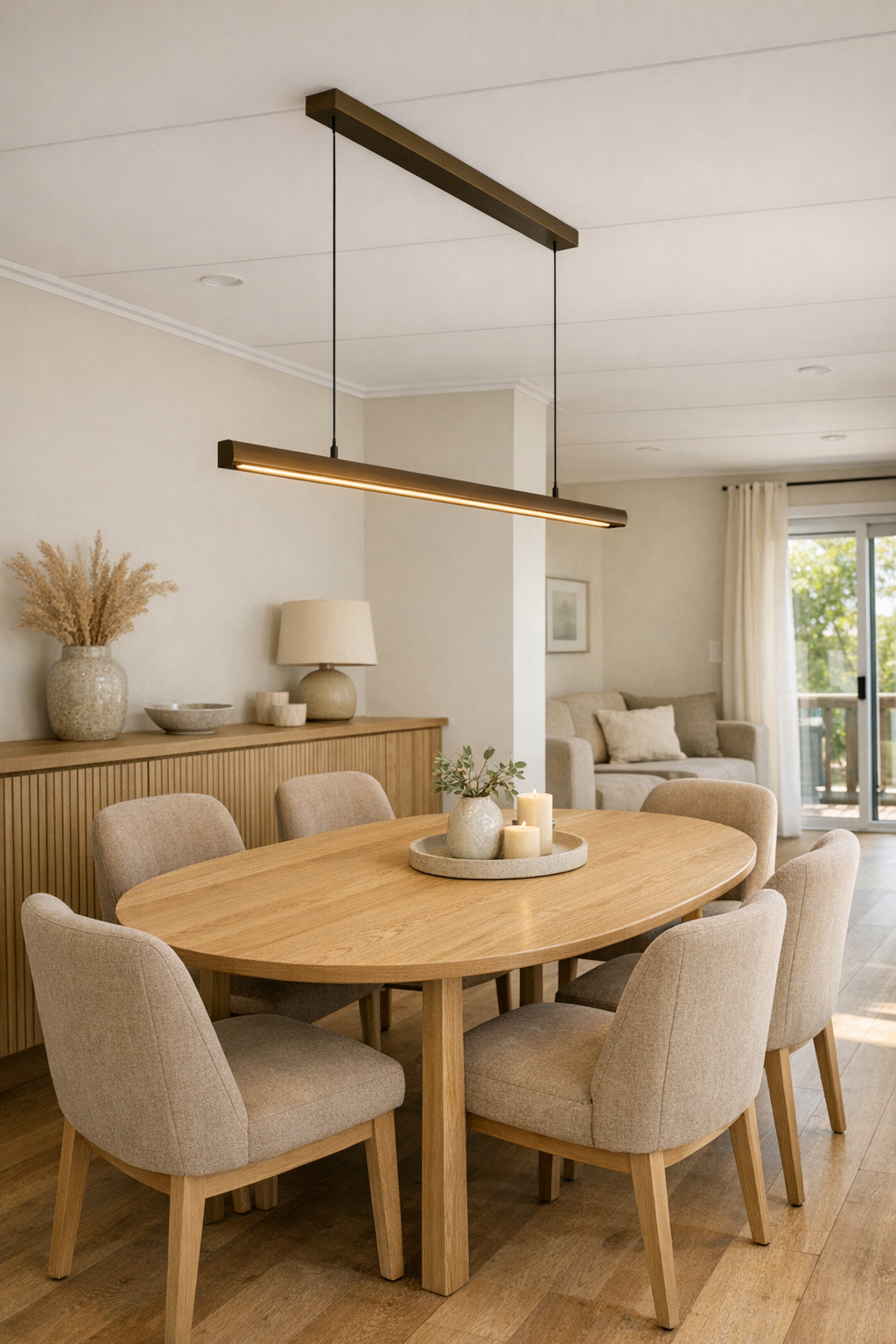
The dining room sits comfortably between the living area and kitchen, and I can already picture it working for everything from weeknight pasta to holiday dessert. A generous oval table in light oak keeps the edges soft and easy to move around, while sturdy upholstered chairs in a warm beige offer comfort without visual heaviness. The shape of the table is a smart choice in an accessible plan because it improves flow and makes the room feel gracious rather than crowded. There is enough clearance all around that the space feels thoughtful, not simply compliant.
Design-wise, the room leans into quiet elegance. A linear pendant in a soft bronze finish hangs above the table, giving the area definition while still keeping sight lines open. One wall holds a built-in sideboard with ribbed wood fronts and a durable stone top, perfect for setting out drinks, serving dishes, or a simple family-style meal. I always think dining rooms work best when they invite people to linger, and this one absolutely does, thanks to its warm neutral palette, tactile fabrics, and connection to the kitchen just steps away.
Kitchen
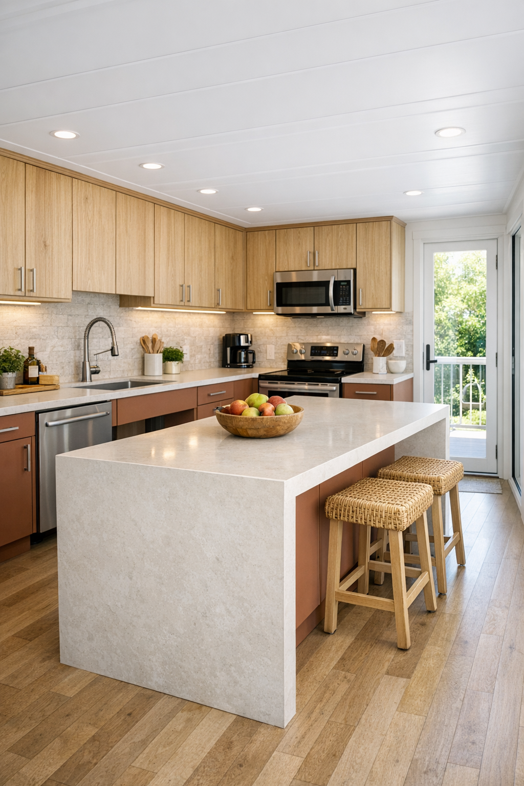
The kitchen is, honestly, the heart of this home for me. It has that wonderful combination of efficiency and generosity that makes cooking feel easier, whether you are making grilled cheese for a couple of kids or laying out a whole spread for friends. The cabinetry is a beautiful mix of flat-panel clay-toned lowers and pale oak uppers, with open stretches of counter that make prep work feel calm and organized. A waterfall island in creamy honed quartz offers plenty of workspace, and its proportions are roomy without overwhelming the floor plan.
I especially love the practical details woven into the design. Wide aisles make movement smooth, hardware is easy to grip, and the appliance layout feels intuitive in the way a really good family kitchen should. A full-height backsplash in softly veined stone adds subtle pattern, while under-cabinet lighting brightens the work surfaces without glare. If I were cooking here, I would absolutely use the island for a little self-serve snack board or a simple toppings station, because the kitchen has that same welcoming spirit as the rest of the home: beautiful, usable, and ready for people to gather.
Bedroom
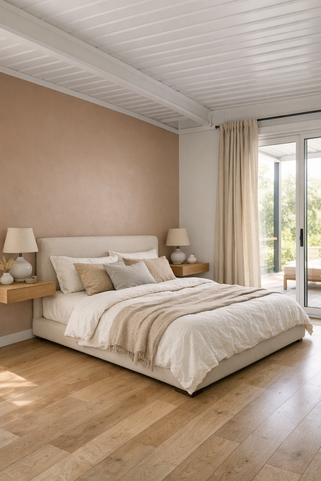
The bedroom continues the home’s soft, restorative palette in a way that feels instantly relaxing. A low upholstered bed in warm ivory sits against a clay-washed feature wall, and the contrast is subtle enough to feel soothing rather than staged. On either side, floating oak nightstands keep the floor visually open, which helps the room feel larger and easier to move through. Linen bedding in layers of cream, camel, and dusty rust adds just enough color variation to make the room feel warm and deeply comfortable.
What stands out most is the restraint. Instead of crowding the room with furniture, the design relies on a few well-chosen elements: a softly curved bench at the foot of the bed, blackout drapery in a sandy neutral, and a built-in wardrobe that sits flush to the wall for a neat, uninterrupted line. Lighting is gentle and practical, with wall-mounted sconces for reading and recessed ambient light for the rest of the room. It has the quiet, uncluttered feeling that makes bedtime seem a little easier, and as a parent I always appreciate any space that helps the whole house exhale.
Bathroom
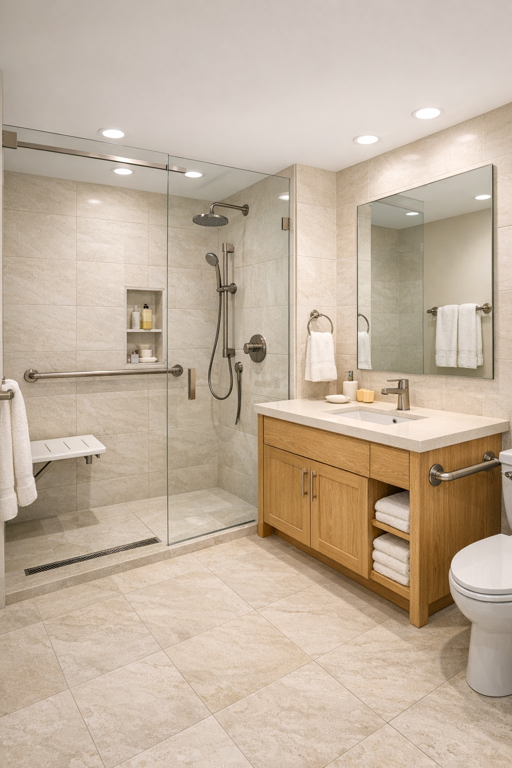
The bathroom is one of the clearest examples of how accessibility can look refined and serene. Large-format porcelain tile in a pale limestone tone gives the room continuity and keeps grout lines minimal, which always helps a space feel cleaner and more expansive. A curbless shower with a frameless glass panel makes the whole room feel open, and the brushed metal fixtures add just enough contrast against the softer finishes. The vanity is simple and handsome, with oak cabinetry below and a creamy solid-surface counter above.
I also like how the room avoids the coldness that can sneak into highly functional baths. A backlit mirror casts an even glow, woven storage baskets bring in a touch of texture, and plush cotton towels in warm white soften the harder surfaces. There is enough turning space that the layout feels comfortable and intentional, and the details all support ease of use without drawing too much attention to themselves. It is a bathroom that feels calm at the start of the day and restful at the end, which is exactly what I want in a home like this.
Other Areas
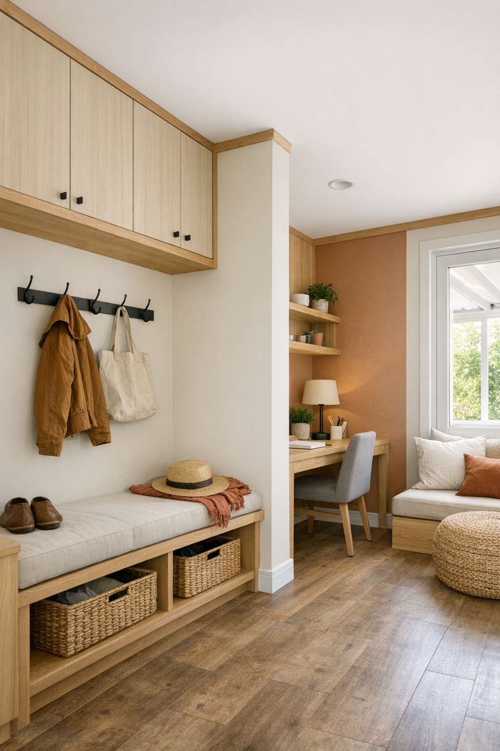
Beyond the main rooms, the supporting spaces are handled with just as much care. The entry nook includes a built-in bench, easy-reach hooks, and closed storage for shoes, bags, and all the little things that tend to collect near the door in real family life. A hallway lined with soft wall lighting and pale oak trim feels more like a calm transition zone than a leftover passage. Even the laundry area is thoughtfully planned, with side-by-side machines, open shelving, and a folding counter that would make everyday chores feel a little less hectic.
There is also a flexible bonus area that I think many families would use in different ways over time. It could be a reading corner, a home office, a play-and-project zone, or even a quiet spot for homework near the main living spaces. The design keeps it cohesive with the rest of the home through the same clay, cream, and oak palette, along with durable flooring and simple, rounded furniture forms. I always notice when a house plans for ordinary life instead of just the pretty moments, and these extra spaces do exactly that.
Why You'd Live Here
You would live here because it proves that accessible design can be deeply attractive, emotionally warm, and genuinely easy to live in. So many homes manage to be stylish or practical, but this one really delivers both. The materials are durable without feeling hard, the layout supports smooth daily routines, and every room has a softness that makes modern architecture feel more personal. It is the kind of place that would work beautifully for quiet mornings, busy school nights, and long dinners with people you love.
For me, the biggest draw is how this home treats comfort as a form of beauty. Nothing feels fussy, and yet nothing feels overlooked either. From the welcoming kitchen to the uncluttered bedroom and the thoughtfully planned circulation throughout, it all adds up to a home that would make everyday life simpler and sweeter. And honestly, that is what the best homes do: they help take care of the people inside them.